Upcoming webinar on 'Inforiver Charts : The fastest way to deliver stories in Power BI', Aug 29th , Monday, 10.30 AM CST. Register Now
Upcoming webinar on 'Inforiver Charts : The fastest way to deliver stories in Power BI', Aug 29th , Monday, 10.30 AM CST. Register Now
Small multiples are particularly effective in showcasing changes over time, differences among categories, or variations across geographical regions. This visualization approach not only improves clarity and insight but also minimizes cognitive overload by presenting information in a consistent format. As you learn to master small multiples, you will gain the ability to create compelling narratives that engage your audience and convey complex information in an intuitive and accessible manner.

Small multiples are compact images or charts arranged in a grid-like matrix. The main purpose of small multiples is to allow the viewer to easily compare and contrast the data across different categories, locations, or time periods by viewing the visualizations side-by-side. This makes it easier to spot differences, outliers, and trends that may not be as apparent when viewing the data in a single large chart.
Even if you haven't encountered a small multiple charts before, you might be familiar with Andy Warhol's iconic artwork, the 'Marilyn Diptych’. Created in 1962, this screen print is a hallmark of the pop art movement, which brought elements of popular culture into the realm of fine art.

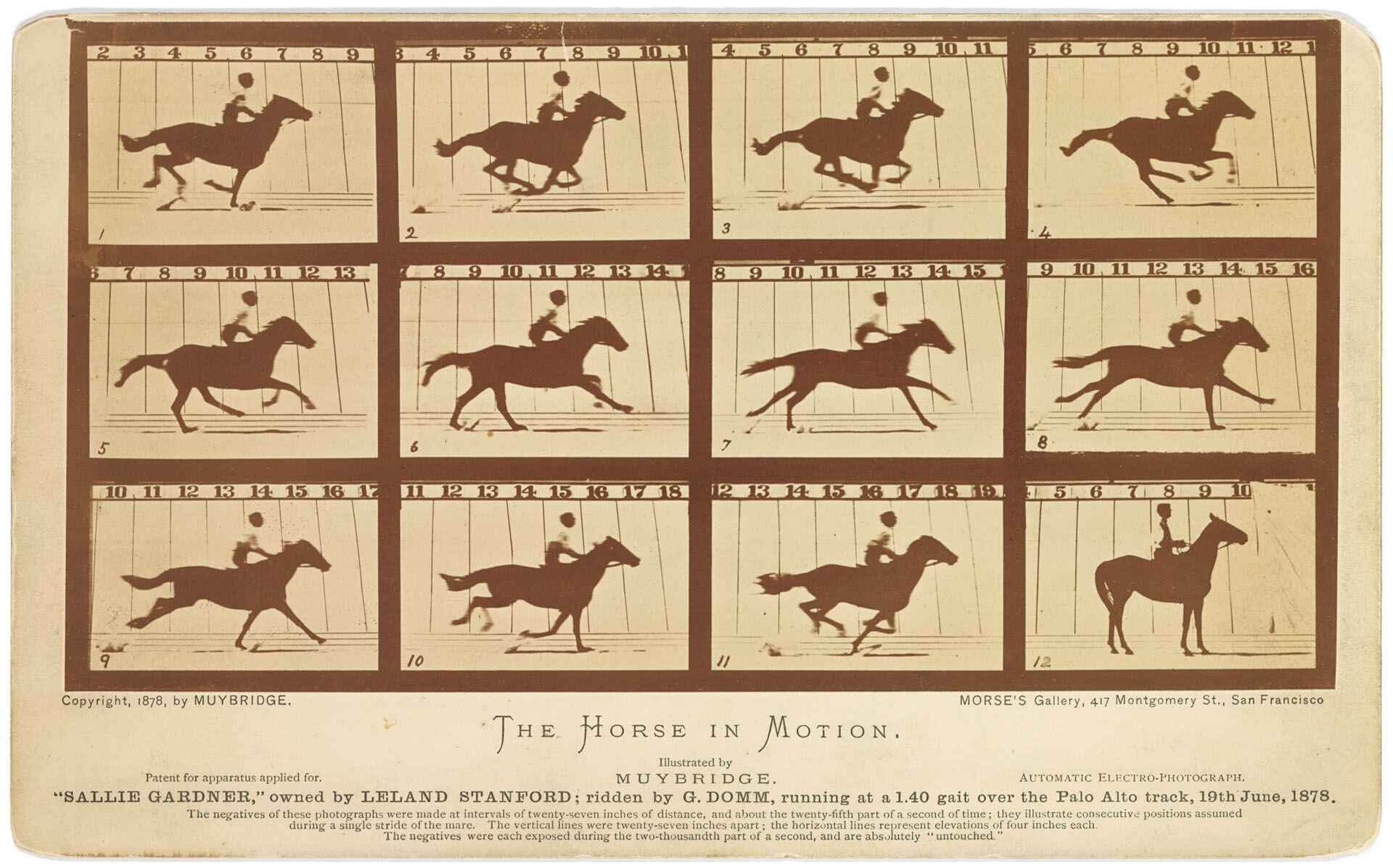
Another famous example of small multiples is Eadweard Muybridge's ‘The Horse in Motion’. In 1872, a railroad baron asked Muybridge to find out if there was ever a moment during a horse's stride when all four hooves were off the ground at the same time. After several years, Muybridge answered this question in 1878 with a series of photographs.
He captured a horse named Sally Gardner on film, and these photos showed that there is indeed a moment when all four hooves are off the ground. Muybridge presented these photos as a series of small multiples since animation did not exist at that point in history. By placing these images side by side, he created an early form of small multiples.
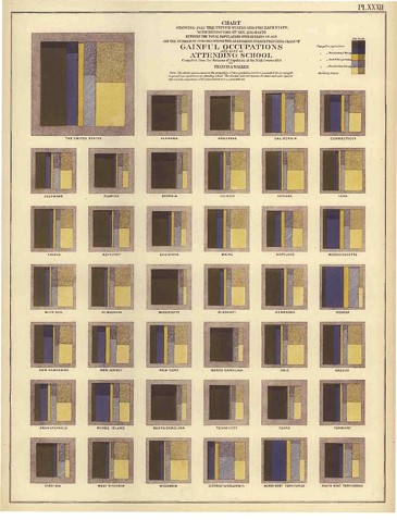
Small multiple charts have a long history. The example below of a small multiple tree map from 1870 depicts people with “gainful occupations” and those attending school in the United States. Each panel in this chart represents one U.S. state, while the panel in the top left corner shows the total for the entire country.
Their enduring popularity is a testament to their effectiveness; the information density, compactness, and ability to draw the viewer's attention have made small multiples a timeless tool for data visualization, still highly relevant today.
The term "small multiple" was popularized by the renowned data visualization expert, Edward R. Tufte. In his book “The Visual Display of Quantitative Information,” he discusses the concept of graphical excellence and defines it as follows:
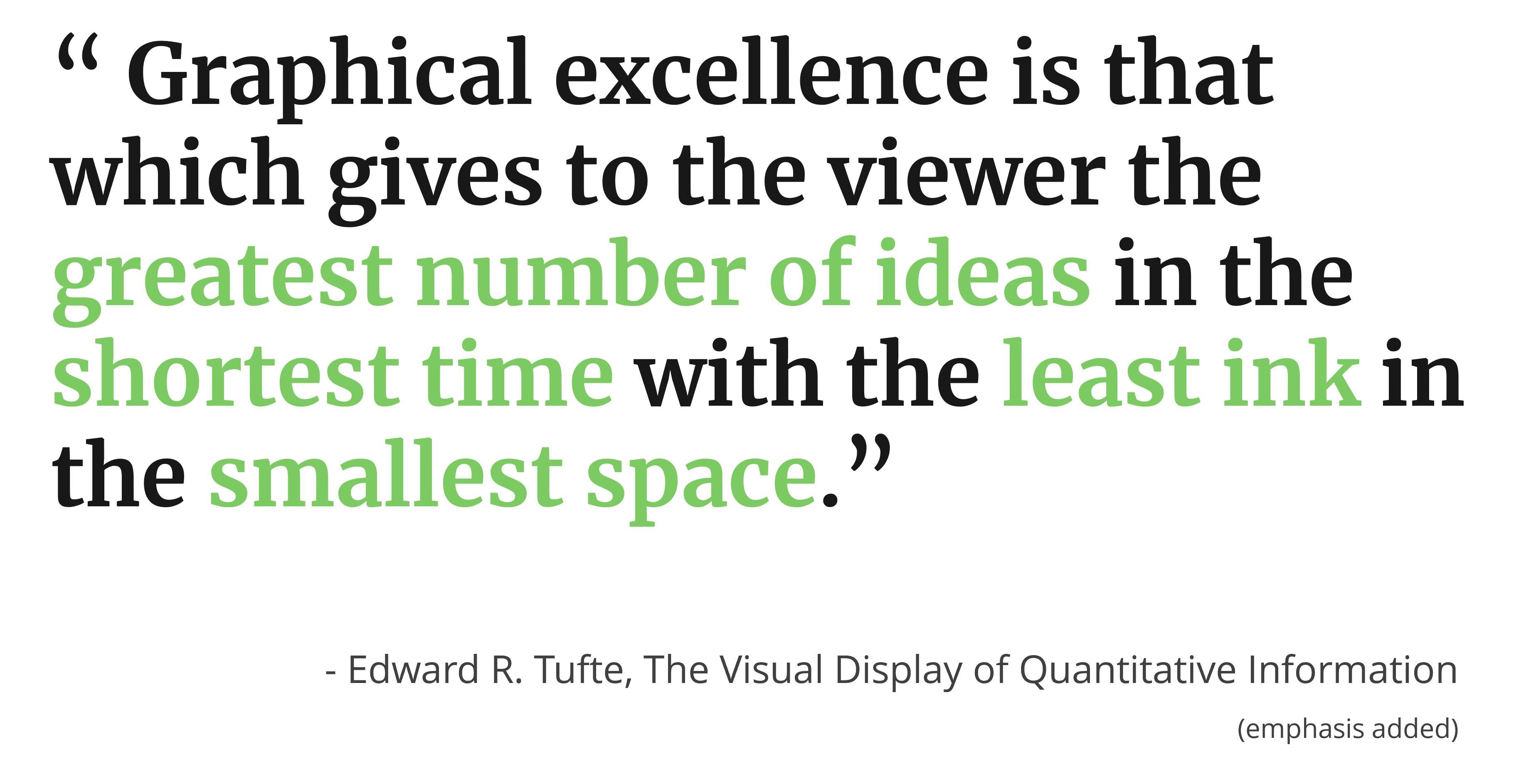
There are four key conditions here for high quality data visualization:
When we evaluate small multiples against these conditions, they meet all four criteria. This makes small multiples an essential part of any data visualization toolkit.
There are many advantages to using small multiple charts. Here are some key benefits:
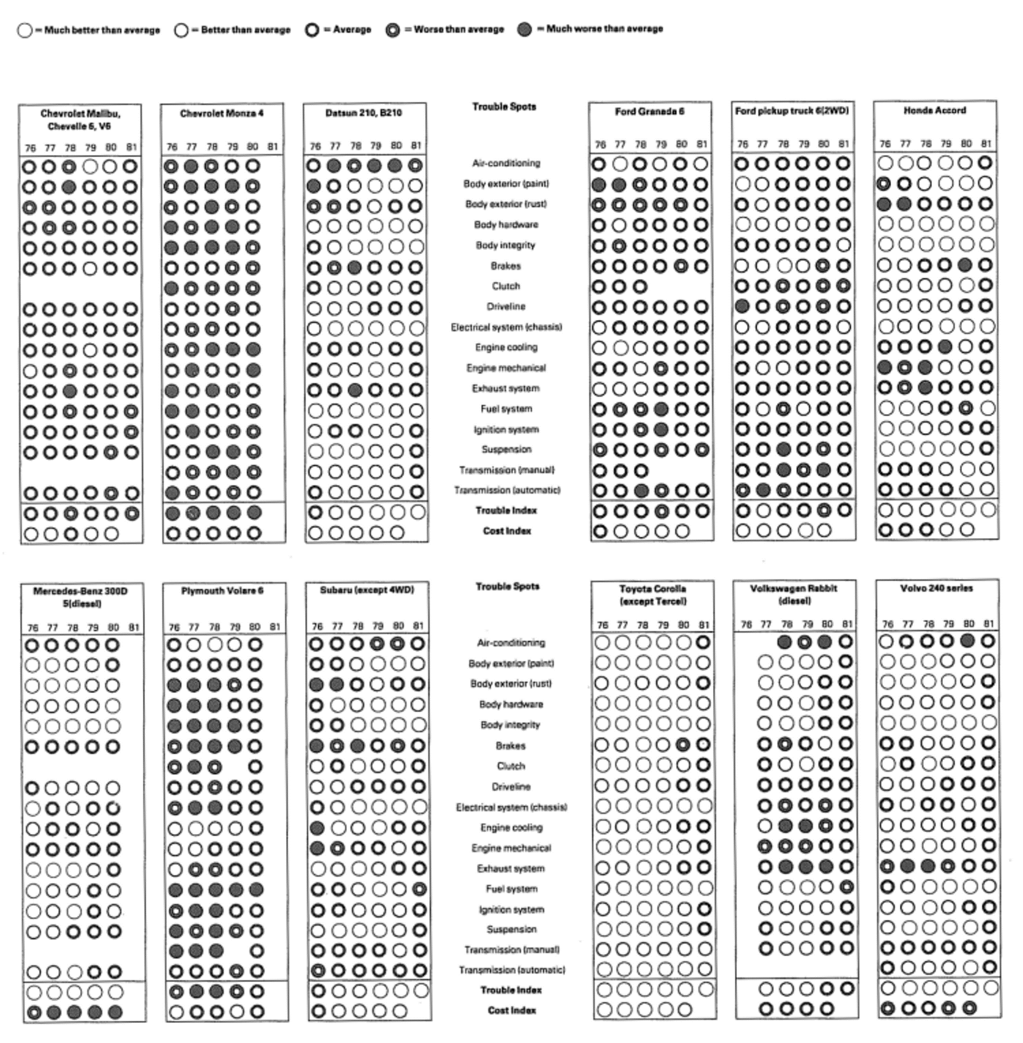
One key benefit of small multiples is their ability to pack a large number of data points into a relatively small area. For example, consider a chart depicting the frequency of car repairs for different models. Each row represents a different type of repair, each panel represents one car model, and the columns within each panel represent different years.
This chart displays around 1,400 data points within a very compact space, including 18 types of repairs and two rating metrics for 12 cars, all measured across six years. The frequency of repairs is rated on a five-point scale shown at the top of the chart. This efficient display of data allows for easy comparison and analysis across multiple dimensions simultaneously.
Another advantage of small multiple charts is their ability to provide an overview along with detailed insights. Not only do they allow us to display a large number of data points, but they also help us grasp the big picture.
The human eye has a resolving power of 0.1 millimeters, meaning we can distinguish between two objects that are just 0.1 millimeters apart. This capability enables us to pick out individual details from these charts.
For instance, in a chart depicting grocery store geography, we can see both the fine details and the overall layout, making it easier to understand the broader context and specific nuances simultaneously. This versatility makes small multiple charts highly effective for a wide range of applications.
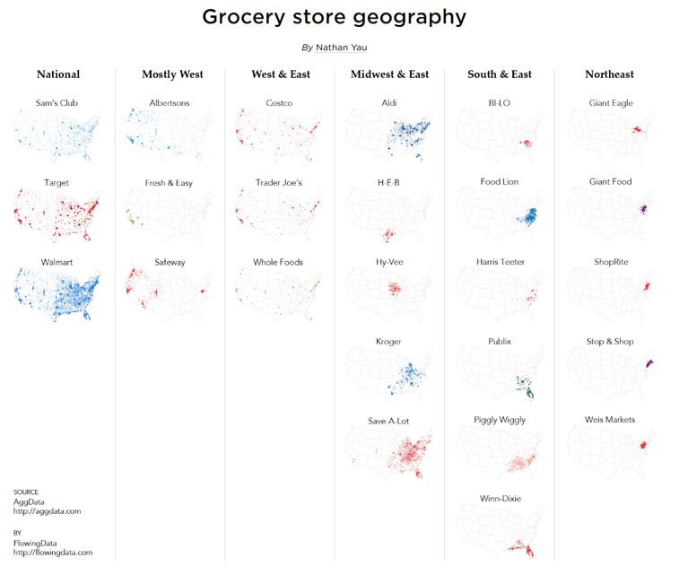
Another advantage of small multiple charts is that understanding one chart means understanding them all. Once the information from the first chart is grasped, this understanding can be applied to a large number of charts, enabling the reader to rapidly take in more data .
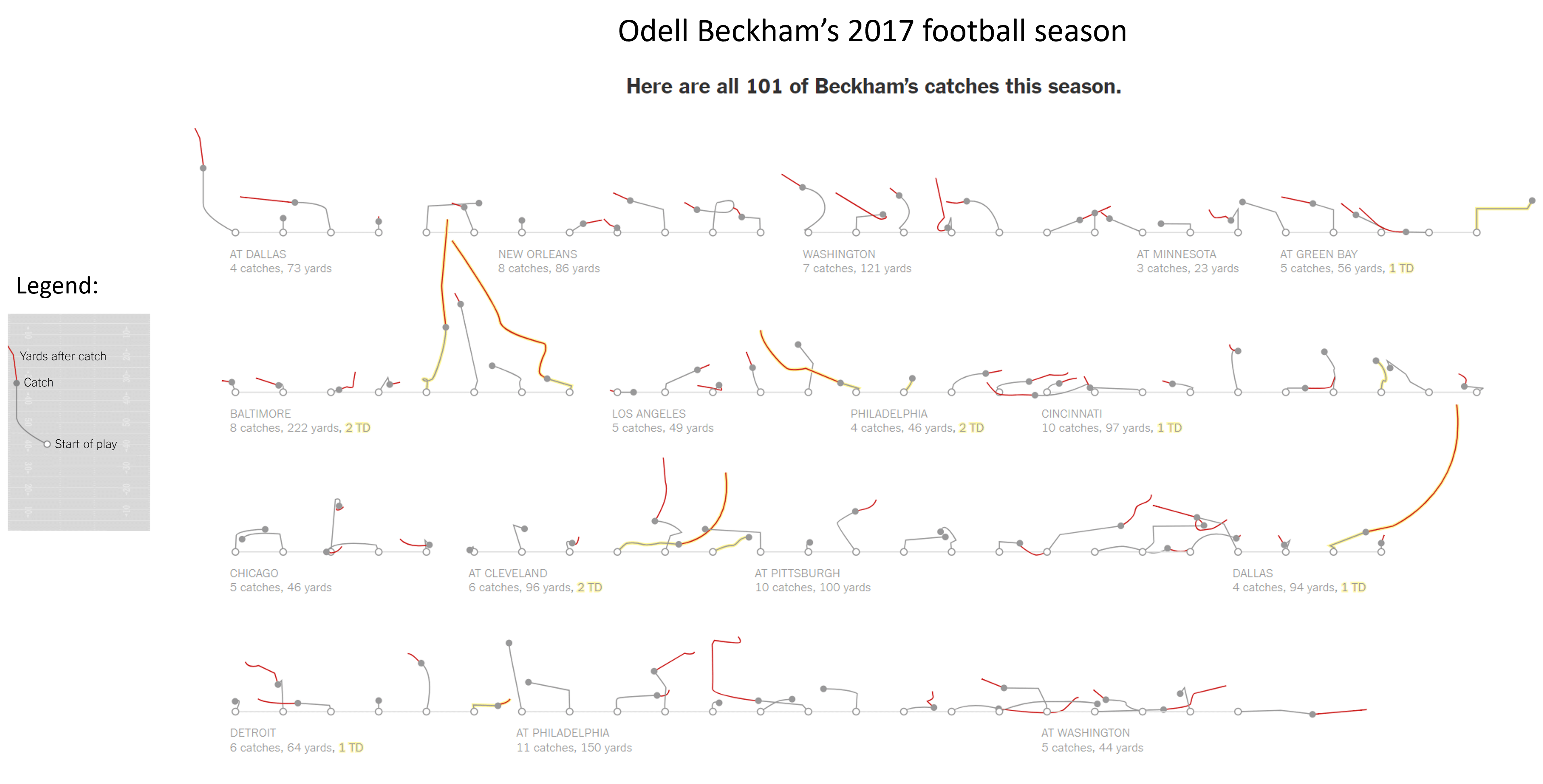
For example, the chart below representing Odell Beckham’s 2017 football season might initially seem complex or unfamiliar. However, with the help of a legend, you can quickly decode it: the start of play is marked by a white dot, the path travelled is shown in grey until the catch, and the yards travelled after the catch are in red line. Once you understand this pattern, you can easily interpret all similar charts, making data consumption much more efficient and intuitive.
Another great advantage of small multiple charts is their ability to facilitate multivariate comparisons. Multivariate comparisons refer to the process of analyzing and understanding relationships between multiple variables simultaneously.
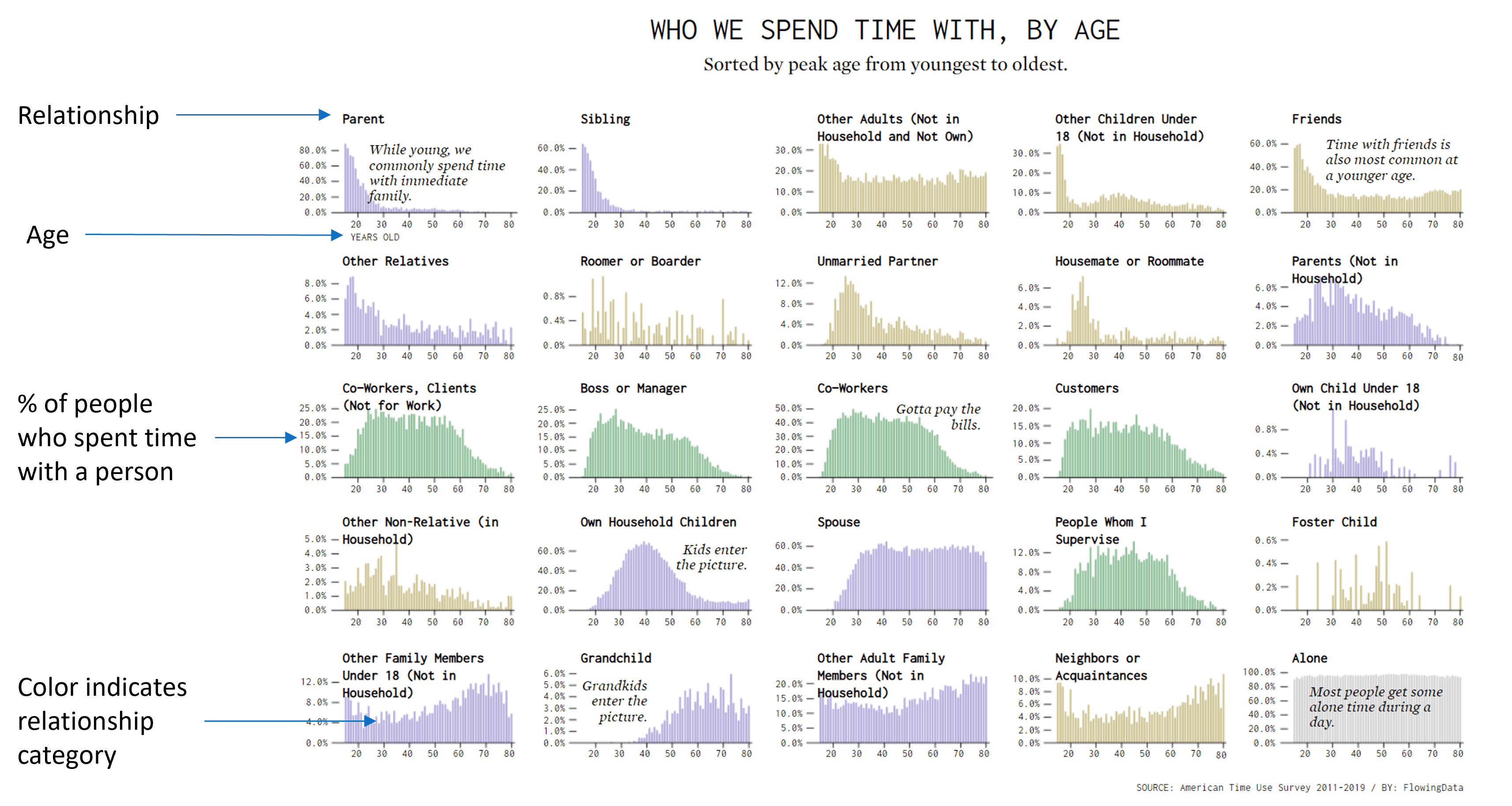
For instance, the chart below illustrates how people spend time with others based on age. It presents four distinct variables: the individual charts show relationship categories like parents or siblings, with color-coded categories representing different types of relationships, and within each chart, we have age on the x-axis, the percentage of individuals spending time together on the y-axis. Each panel in the grid represents a unique combination of these variables, allowing for a comprehensive view of multiple dimensions within a single visualization.
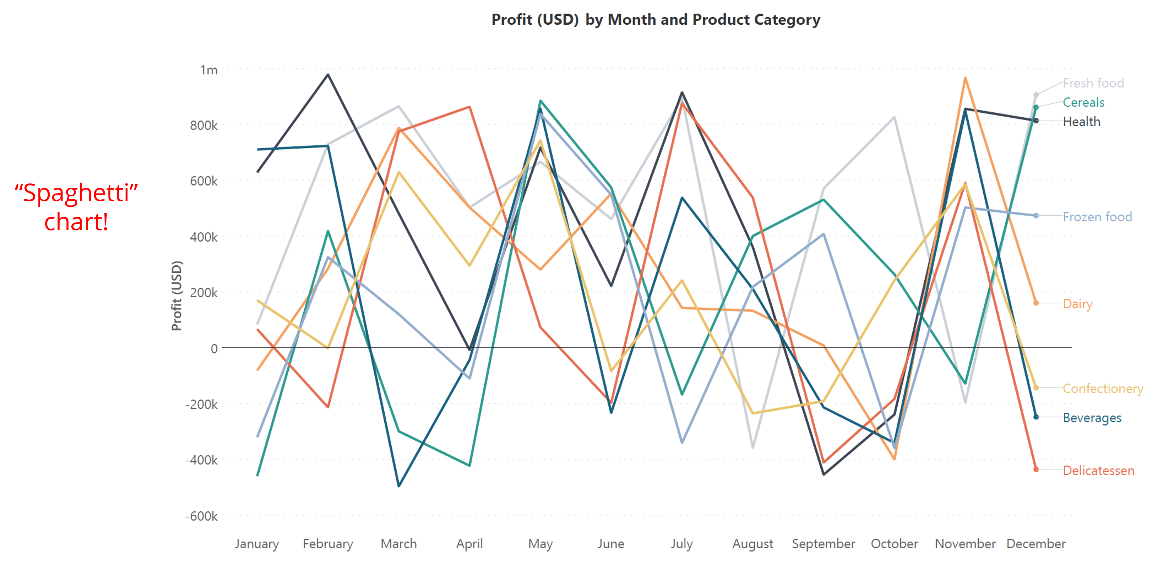
A “spaghetti” chart, illustrated here, is characterized by its dense, overlapping lines that make it challenging to extract meaningful insights. This is a frequent problem with charts that carry a large amount of information. In this example, the chart displays profit
variations by month across various product categories, but its complexity hinders clear interpretation.
Converting this data into small multiples markedly reduces visual clutter. Each small multiple panel isolates profit trends for a specific product category, facilitating clearer visualization and more straightforward comparison of profit changes. This organized presentation enhances analytical clarity.
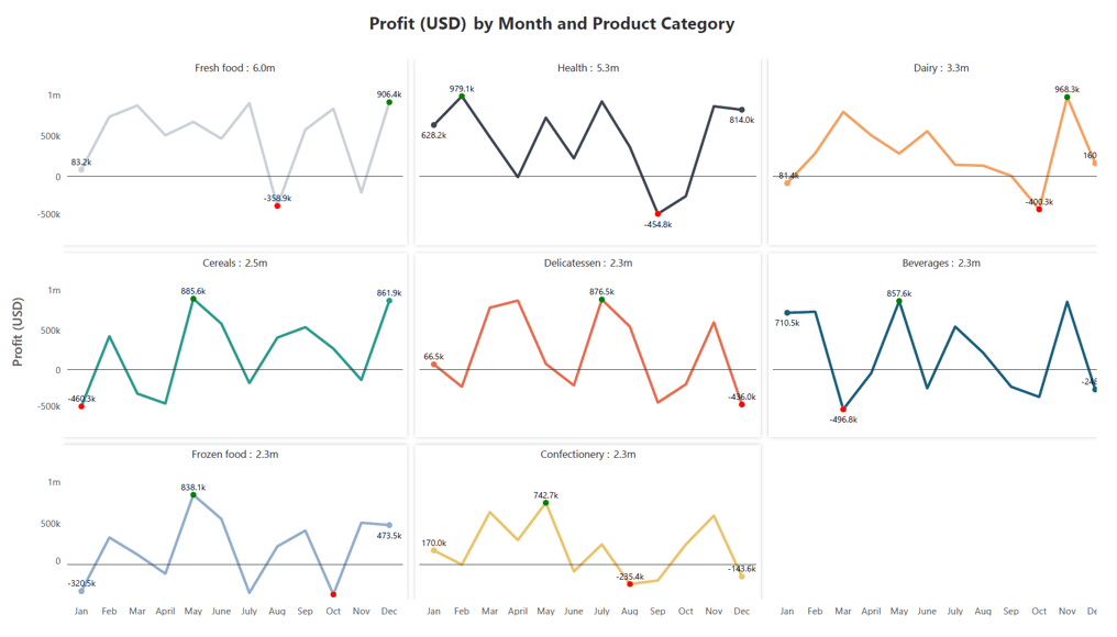
Small multiple charts are incredibly versatile and effective for various data visualization scenarios. They excel in comparing categories, revealing patterns and trends, tracking changes over time, and offering high-resolution views of complex data. Below are some specific use cases that highlight the power and utility of small multiple charts.
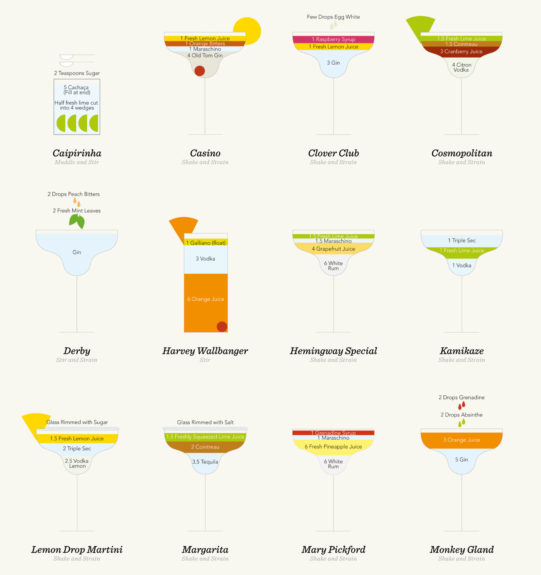
Small multiples are exceptionally useful for comparing different categories, as demonstrated in this example featuring cocktails. Each small multiple panel provides a detailed view of a specific cocktail, including the type of glass used, ingredient proportions, mixing instructions, and serving methods. This setup enables easy comparison between items, allowing for a clear assessment of their respective characteristics and making it simpler to identify similarities and differences among them.
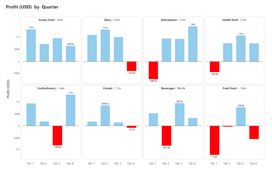
In classic business scenarios, small multiples are employed to analyze profit by quarter across various product categories such as frozen food and dairy as seen in the image below. By presenting each product category in its own panel, these charts facilitate direct comparisons. Stakeholders can quickly discern which product are the most profitable and which are the least, enabling strategic decisions and resource allocations based on clear, visual insights.
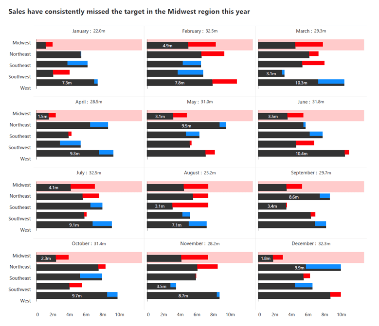
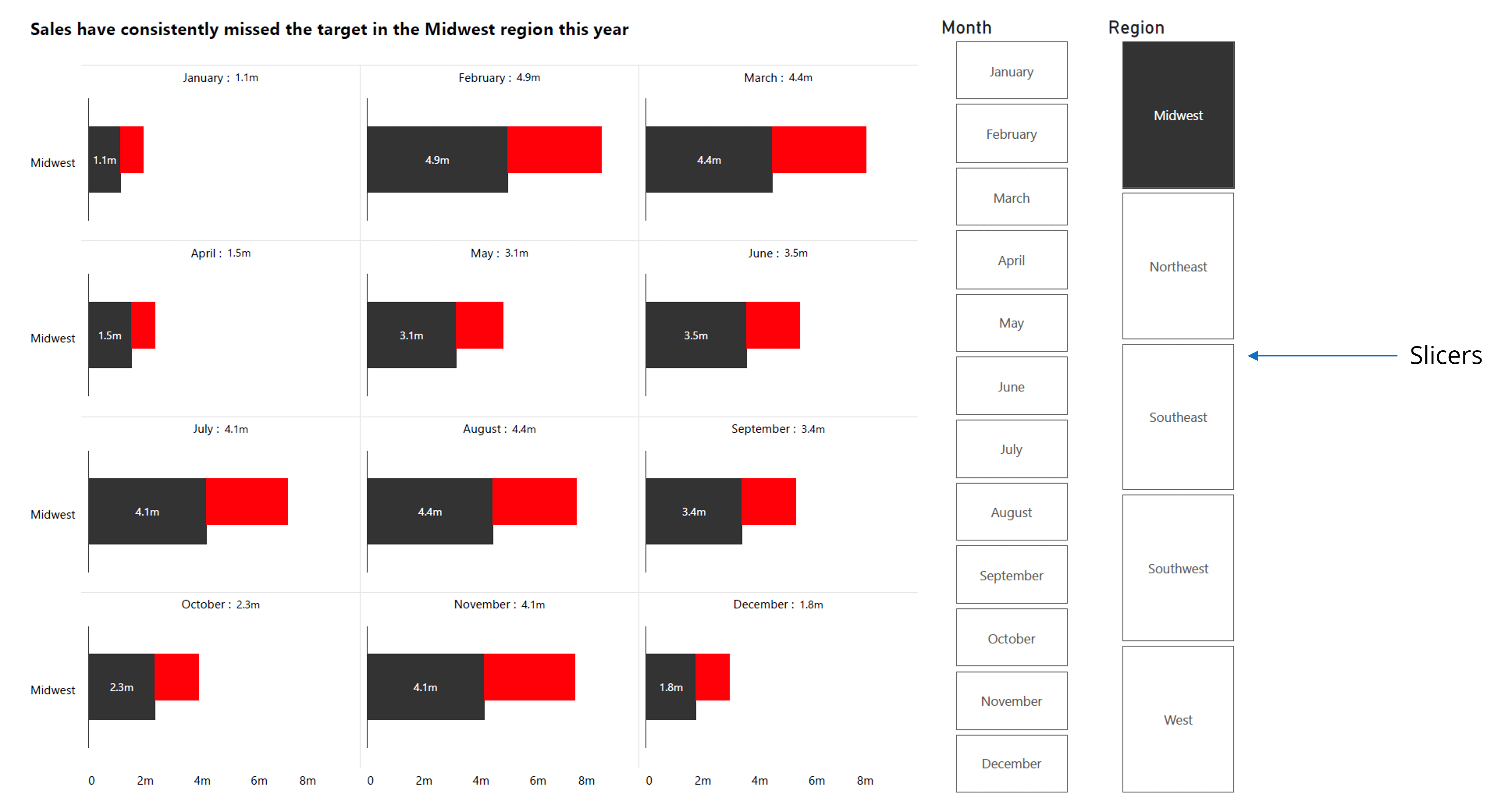
Small multiples shine in revealing patterns and trends across diverse datasets. Taking a classic business use case, in the below chart depicting sales values across different months and regions. This below visualization reveals that the Midwest region consistently falls short of sales targets, indicated by recurring red marks across multiple months.
Such patterns, discernible through small multiples, highlight areas for improvement or adjustment in business strategies to optimize performance across regions and time periods.
In another compelling example, the chart below tracks the rise of partisanship in the US House of Representatives from 1949 to 2012. Each chart is a network diagram representing a specific year and depicts each member of the US House of Representatives as a node with Republicans in red and Democrats in blue. Connections between nodes indicate members who vote similarly above a certain threshold of votes.
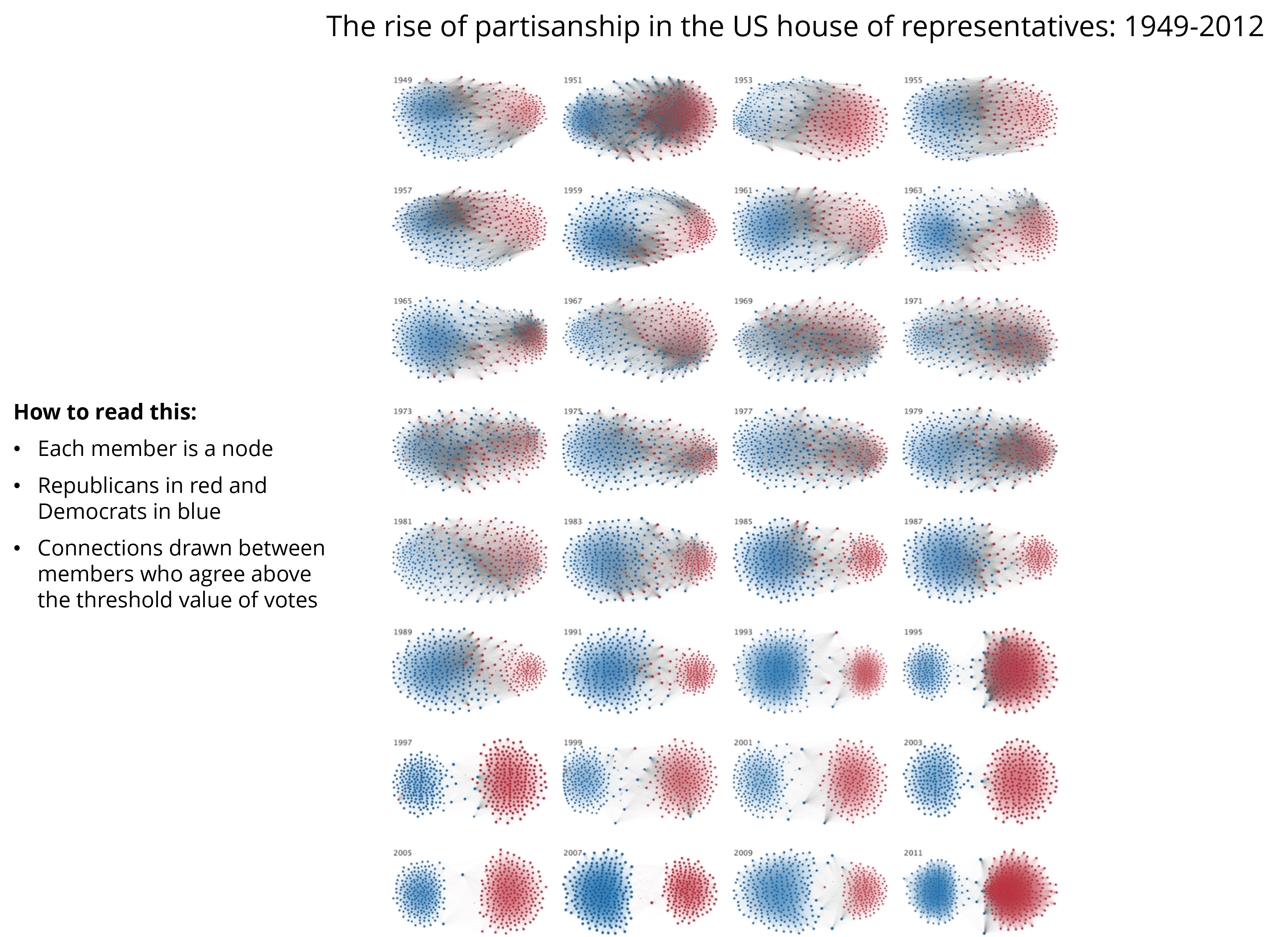
Even without prior knowledge of network diagrams, the visualization clearly shows a once interconnected dataset splitting into two distinct groups by 2012. This stark division reflects the increasing polarization within the House over the years, highlighting how small multiples effectively capture and visualize complex trends and patterns in data.
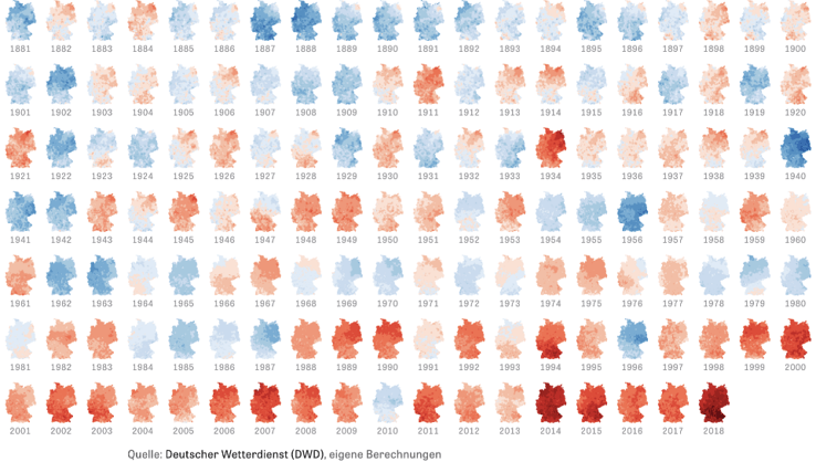
Small multiples are particularly effective in depicting temporal changes because they allow us to observe trends and variations across different periods. By presenting data in a series of small, manageable charts, we can easily discern patterns and understand the evolution of phenomena like temperature trends over time.
Take, for example, temperatures across Germany. This chart illustrates how Germany has experienced warming due to global climate change over the years.
Let's delve into another fascinating use case, which is making comparisons between alternatives. Take, for instance, the small multiple chart shown below dating back to 1659, depicting various theories about Saturn's shape proposed by astronomers of that era.
Back then, the left-hand image reflected alternative theories proposed by astronomers such as Galileo, who observed Saturn through his telescope. The shape of Saturn remained a profound mystery until later astronomers, including Huygens, correctly proposed its ringed structure, as depicted on the right-hand side of the chart.
This historical example showcases how small multiple charts can effectively compare different hypotheses or alternative viewpoints.

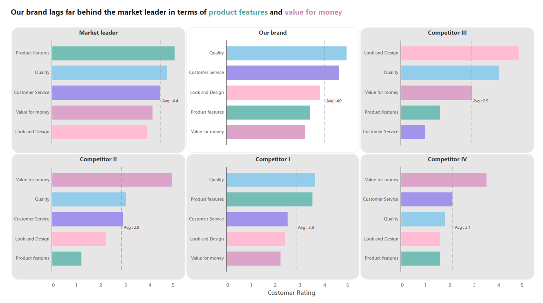
Another valuable application of small multiples is in comparing competitors within a market segment. Take, for example, a scenario where we analyze multiple brands based on their product ratings across various metrics.
In this case, we can visually represent the market leader, our brand, and several other competitors using small multiple charts. Each chart displays the performance metrics of a specific brand, allowing us to easily compare where our brand stands relative to others in the market. This approach not only highlights competitive strengths and weaknesses between brands but also facilitates strategic decision-making and market positioning efforts.

Small multiples excel at providing a high-resolution view of complex data, as demonstrated by this example featuring a map of the United Kingdom.
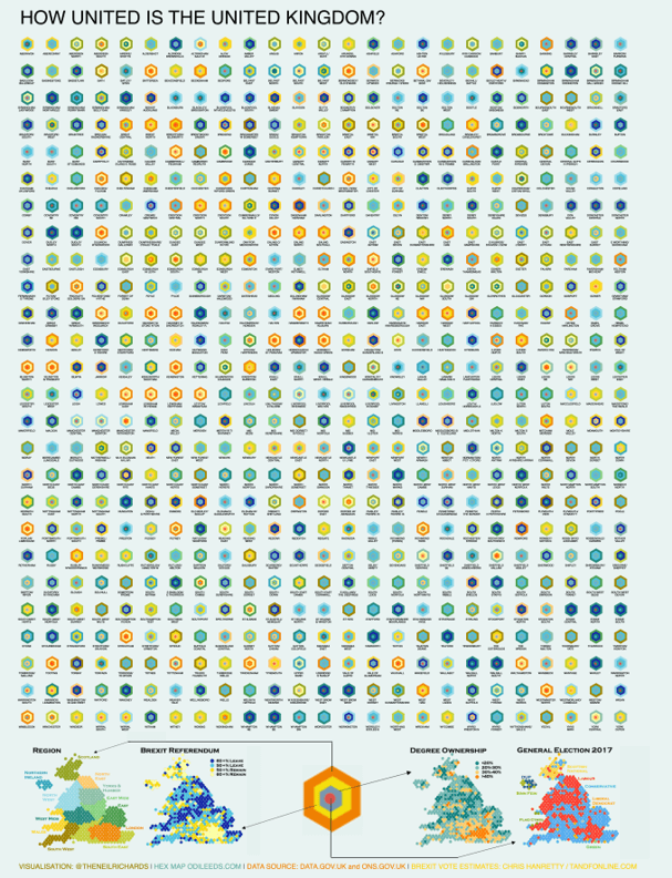
This map visualizes each of the 650 parliamentary constituencies using hexagons, each colored to represent four different metrics: regional data, Brexit voting patterns, degree of homeownership, and results from the 2017 general election.
With such a large dataset—650 constituencies across four metrics giving a total of 2600 data points —the use of small multiples allows for a detailed examination of each metric within specific regions. This approach not only enhances the granularity of analysis but also enables zooming into individual constituencies to observe detailed variations across metrics.
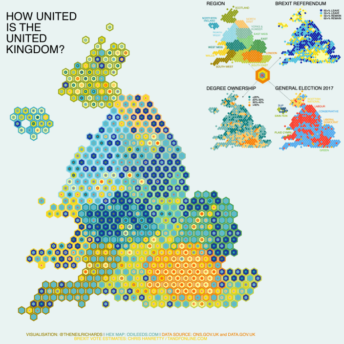
To clarify, by separating the hexagons and arranging them into a grid format, it becomes evident how this visualization adheres to the principles of small multiples.

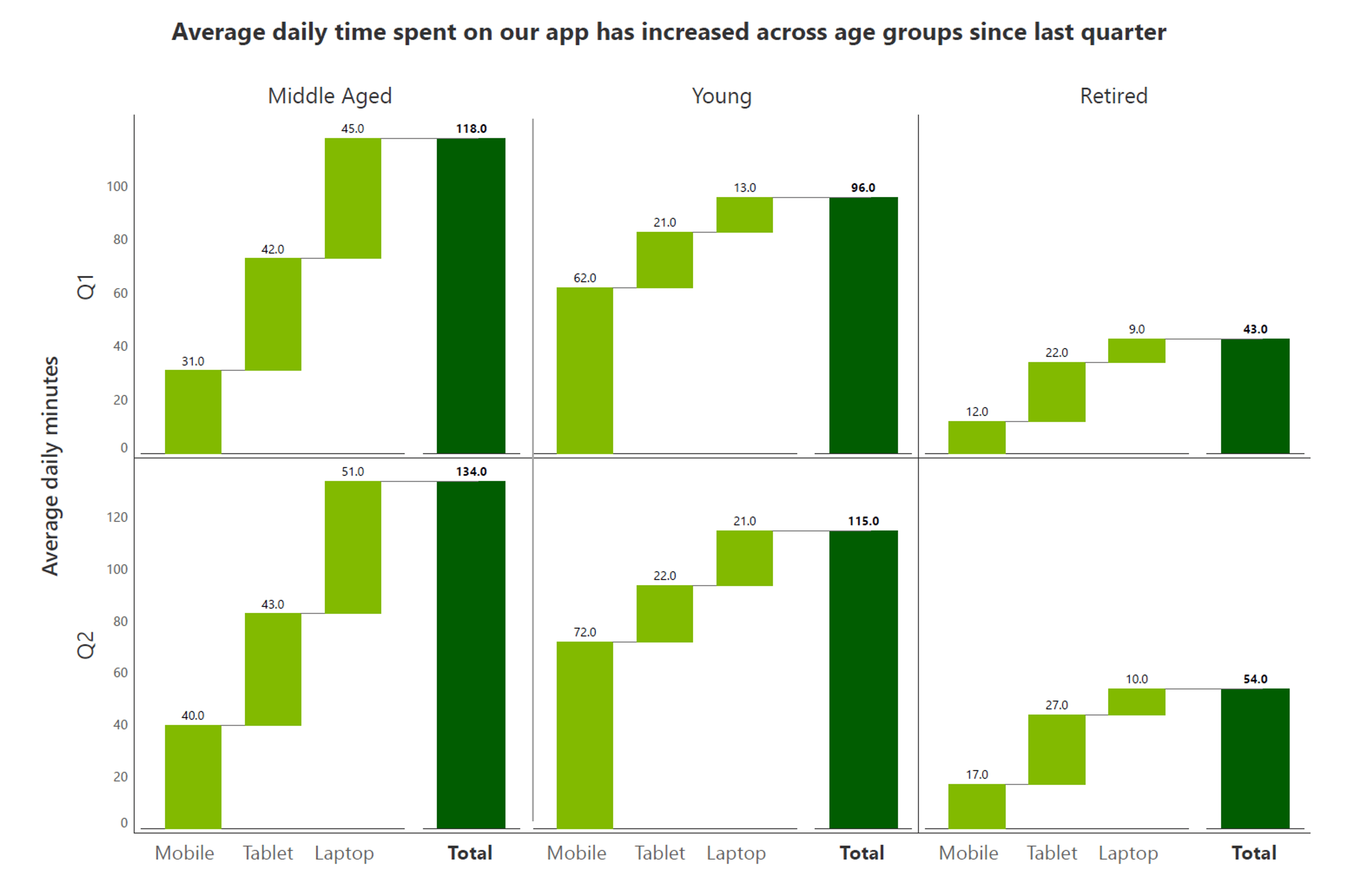
Small multiples are also effective for monitoring multiple variables and dimensions simultaneously. For instance, in the below scenario, we observe the average daily time spent on an app. The columns represent different age groups such as middle-aged, young, and retired, while the rows indicate quarters.
Within each waterfall chart, the x-axis shows the type of device used and the y-axis displays the average daily minutes. This setup allows us to track and compare across various dimensions, providing a comprehensive view of app usage patterns across demographics and time periods.
Another valuable use of small multiples is to compare multiple metrics within the same categories or time periods, also known as measure-based small multiples.
For example, imagine analyzing average order size, profit, and sales across different years, broken down by months. In this setup, the bottom row represents average order size, the second row displays profit, and the top row shows sales. By organizing these metrics as measure-based small multiples, we can effectively compare their trends and performance variations over time, providing insights into business performance across various dimensions simultaneously.

While small multiples offer numerous benefits, they also have certain limitations that might affect their suitability for specific data presentations. Understanding these drawbacks will help you make more informed choices in your data visualization strategy. Let's delve into some key disadvantages.
One drawback of using small multiples is the potential loss of ability to compare relative values effectively. For instance, consider the below scenario where we display sales data by month across different states in separate panels. If we want to compare the sales pattern of one state to another directly or determine when sales in one state exceeded those in another, it becomes challenging because the metrics are separated into distinct charts.
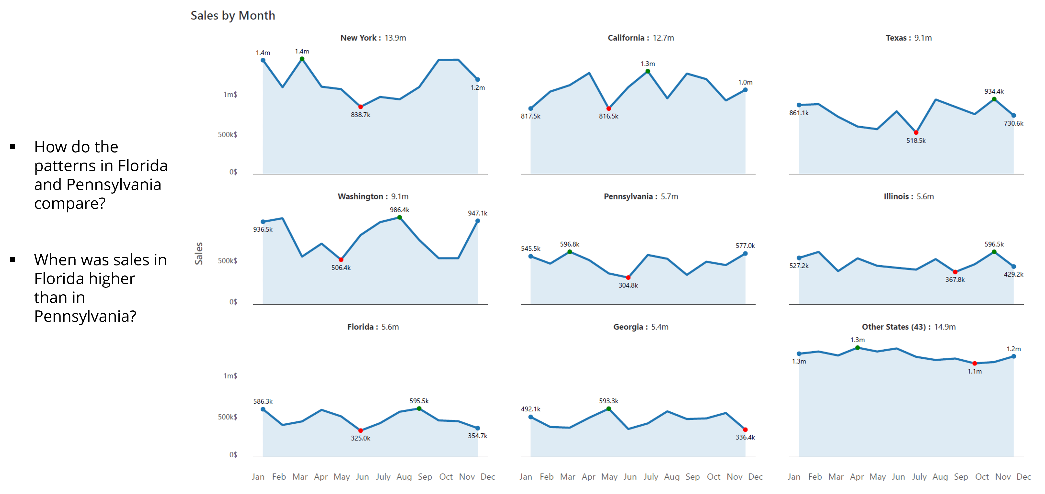
Had these states been plotted on the same chart, such comparisons would be more straightforward and immediate. Thus, the segmentation of data into small multiples can sometimes hinder the ability to make quick and direct relative value comparisons between different categories or time periods.
While a large number of charts in small multiples can make data visually informative and encourage deeper exploration, it can also present challenges. Too many charts can overwhelm readers and make it difficult for them to interpret the information effectively. The sheer volume of visual elements can lead to confusion, potentially detracting from the clarity and impact of the data presentation. Thus, while small multiples can enhance engagement, balancing the quantity of charts is crucial to ensure readability and comprehension for the audience.
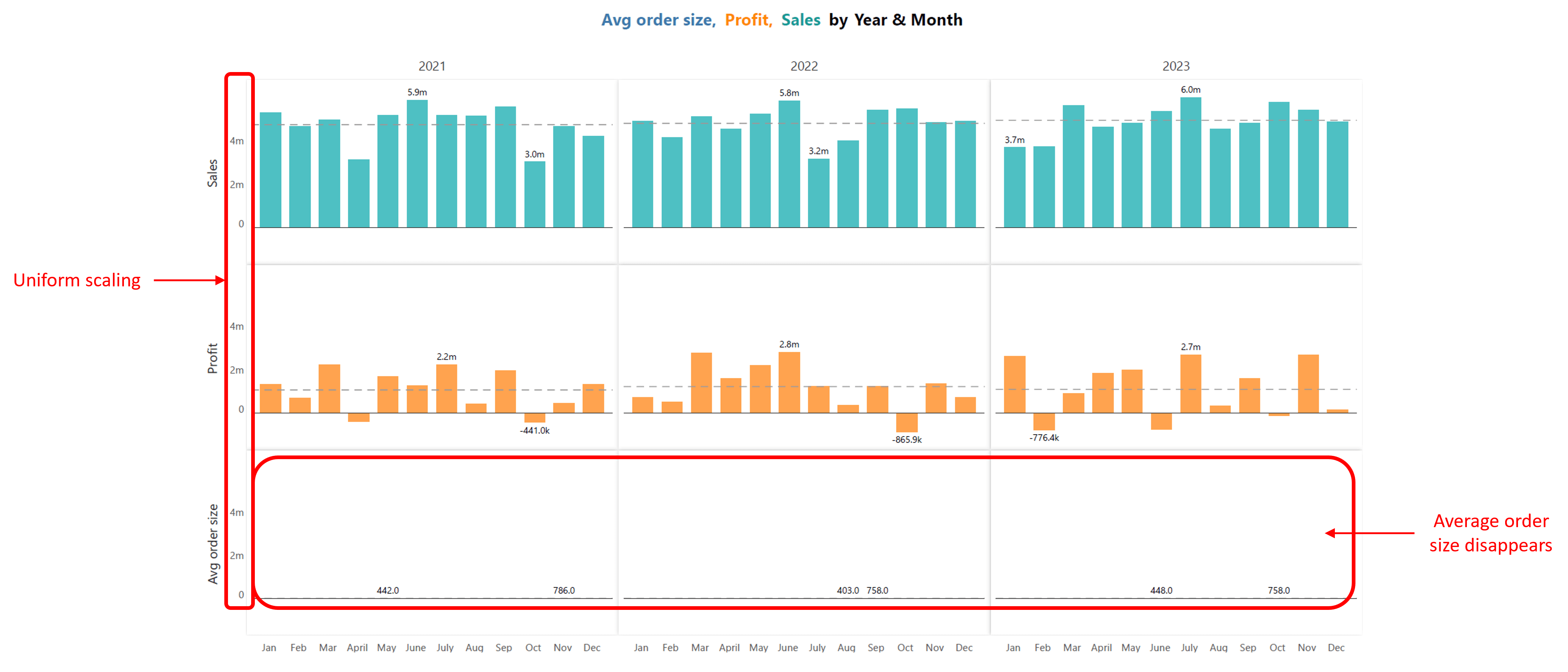
Another common issue with small multiples is dealing with metrics that are measured in completely different units or at vastly different scales.
For instance, one panel may display sales figures in the millions, while another panel shows average order size in the hundreds. When these metrics are plotted using uniform scaling across all panels, it can lead to discrepancies in visual representation. The smaller values, such as average order size, may appear negligible or even disappear entirely when compared to larger values like sales.
This disparity underscores the challenge of selecting appropriate axis scaling to ensure accurate and meaningful comparisons within small multiple charts.
To maximize the effectiveness of small multiples and ensure they are both clear and insightful, it is important to follow some best practices. Implementing these guidelines can greatly enhance the readability and comprehension of your visualizations.
Let's delve into some essential best practices for using small multiples effectively.
One effective strategy is to sort panels in a logical order. For instance, arranging panels by a key metric like sales from highest to lowest, by age groups from youngest to oldest, or alphabetically, allows viewers to quickly grasp important trends and comparisons.
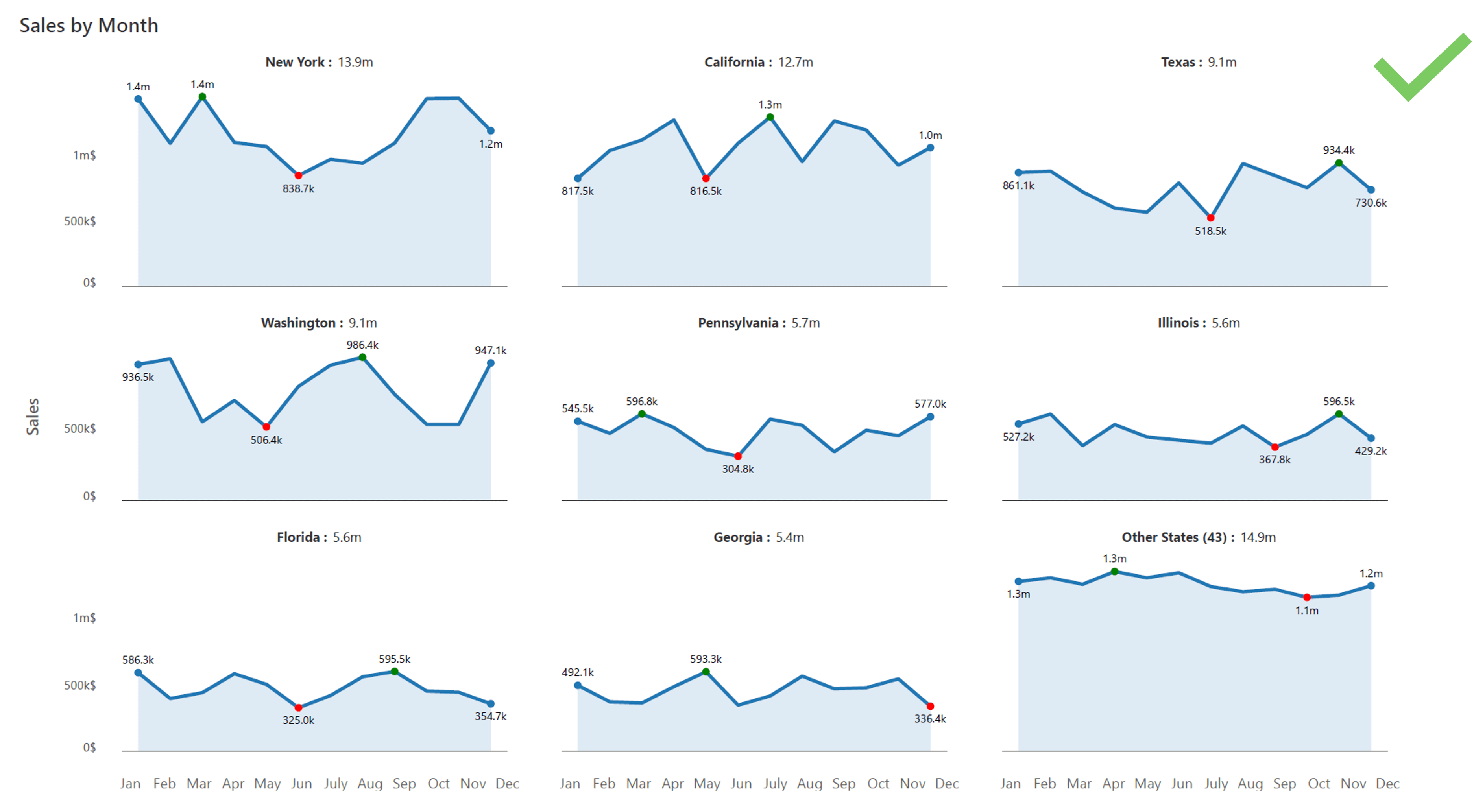
For example, in a chart depicting sales by month across different states, sorting panels by total sales, starting with leading states like New York, California, Texas enhances clarity and facilitates faster understanding of the data presented. This straightforward approach helps readers navigate through the visual information with ease, promoting efficient comprehension of complex datasets.

Managing metrics measured at vastly different scales, as discussed in 4.3, presents a common challenge in small multiples—uniform scaling can cause smaller values to appear negligible or even disappear when compared to larger ones.
A solution to this problem is row-level scaling, which allows each row to be scaled independently. This method ensures more accurate and intuitive comparisons within each metric category.
For example, in a chart showing sales, profit, and average order size across multiple years, row-level scaling allows each metric to be represented clearly, preserving important details while offering a comprehensive overview of performance across different time periods.
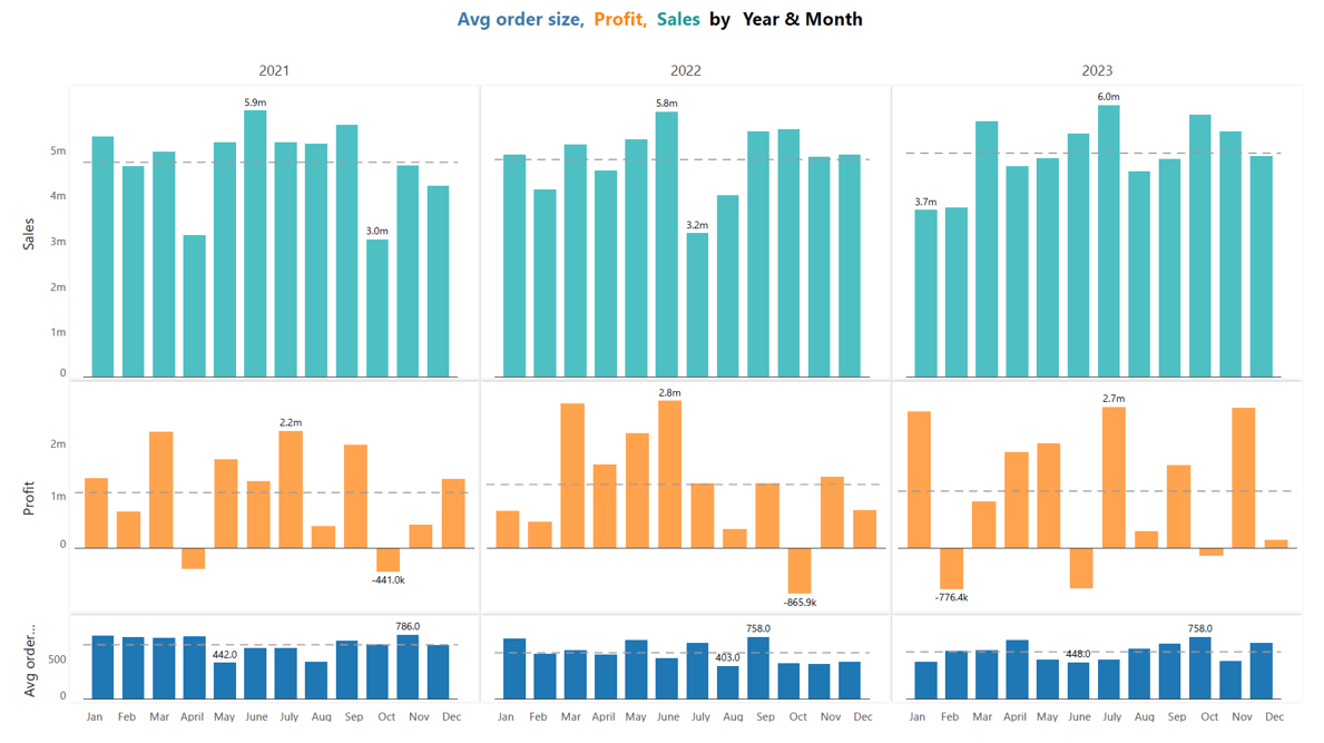
Row-level scaling thus enhances the interpretability of small multiples by maintaining consistency in visual representation while accommodating diverse data ranges effectively.
Small multiples can convey a wealth of data, but presenting too much information can overwhelm your audience. To ensure clarity and impact, it's essential to identify and highlight the central narrative within your charts.
For instance, when analyzing sales versus targets across different regions, you might discover that the Midwest consistently falls short of targets. By focusing on such insights, you can effectively guide your audience towards understanding key trends or anomalies.
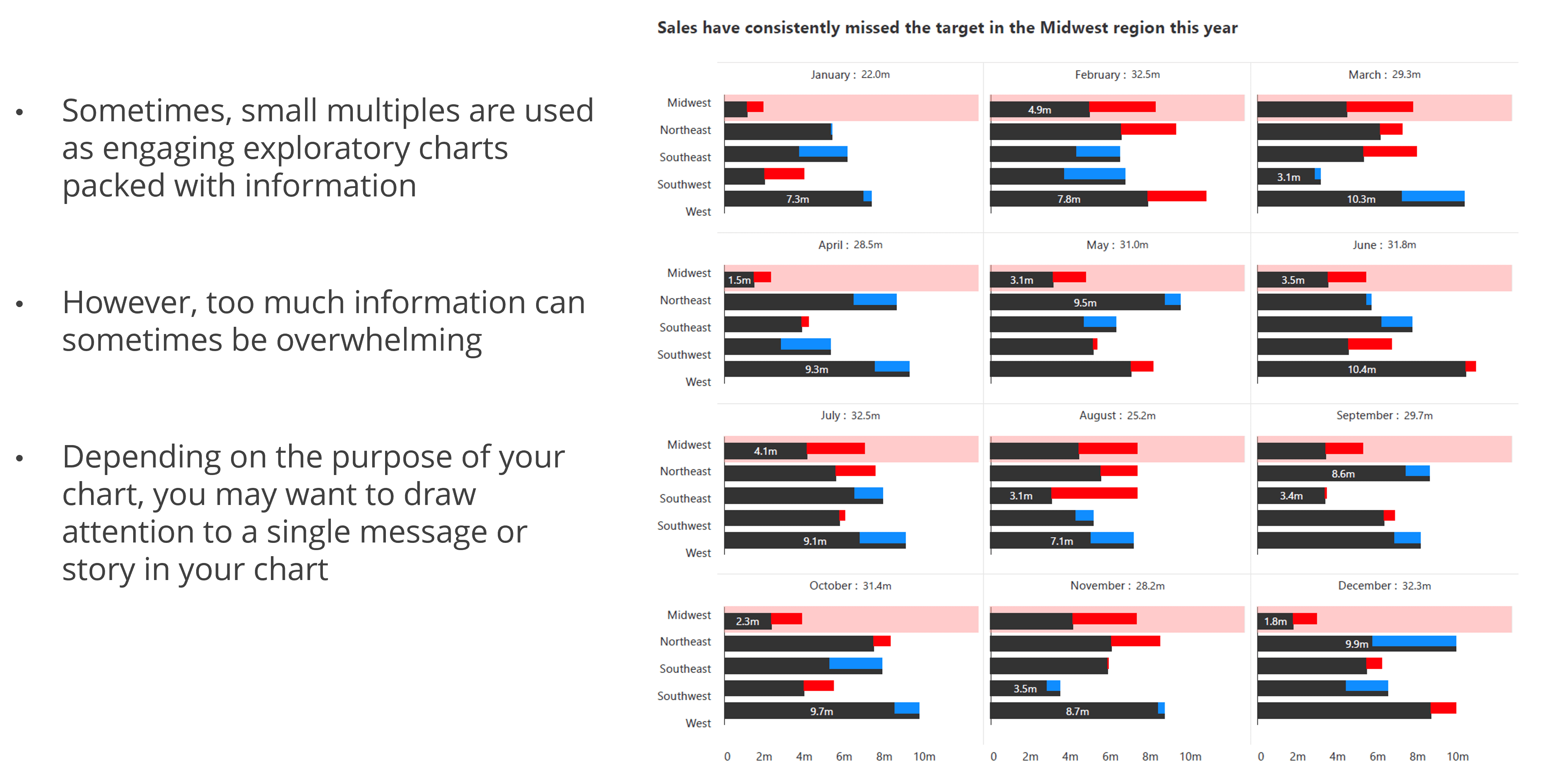
In small multiple charts, displaying a large number of panels can overwhelm viewers and obscure insights. To maintain clarity and focus, consider employing a "top N" approach, where you select and prioritize the most significant panels based on specific criteria such as sales volume or other relevant metrics.
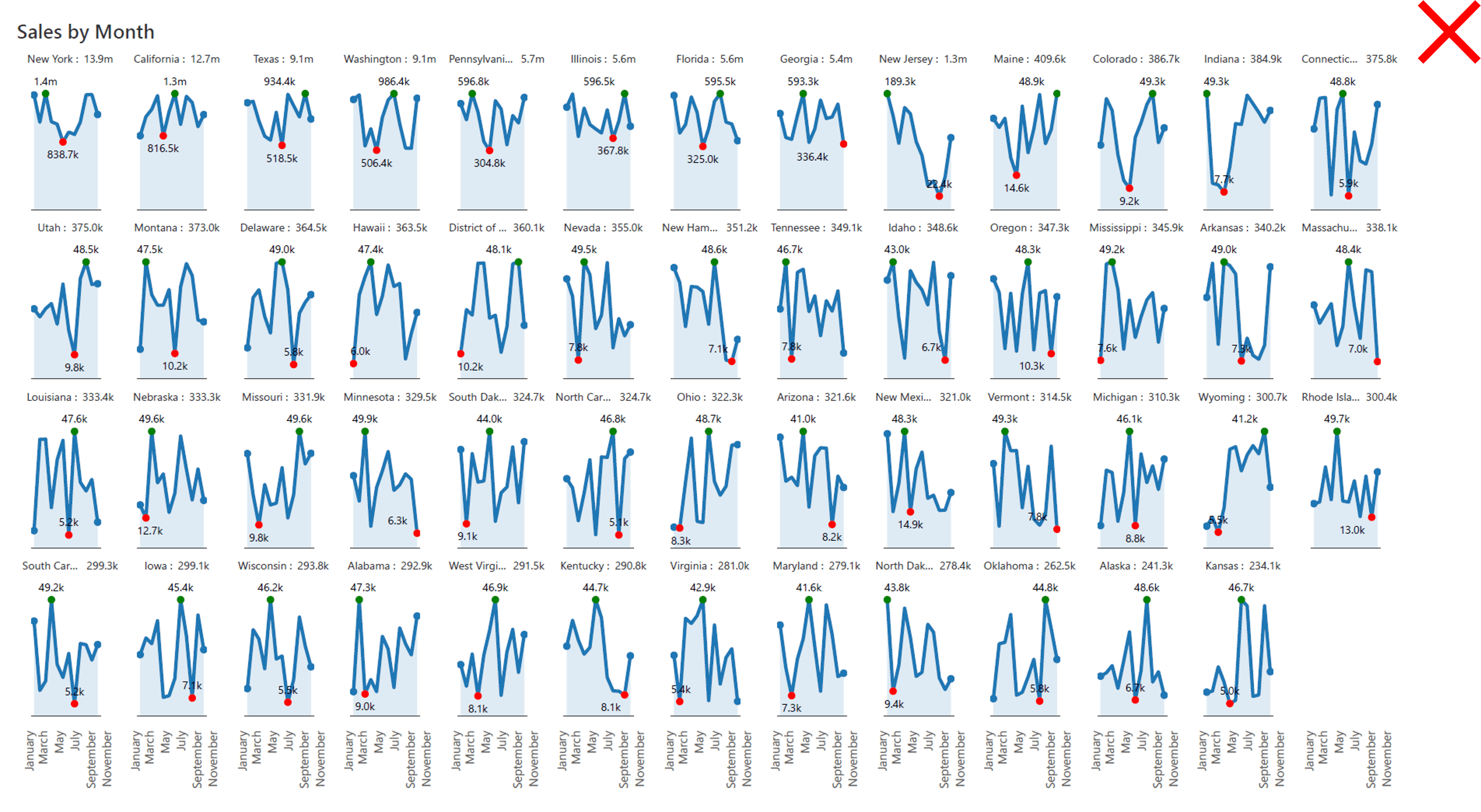
For example, instead of presenting sales data for all 50 states across 12 months, we may highlight only the top-performing eight states along with a chart which sums up all the other states values as shown below. This strategy not only simplifies the visualization but also directs attention to the most impactful data points, enabling clearer interpretation and decision-making.
Rather than overwhelming viewers with numerous individual charts, an intermediate small multiples approach consolidates related data into larger, more informative visuals.
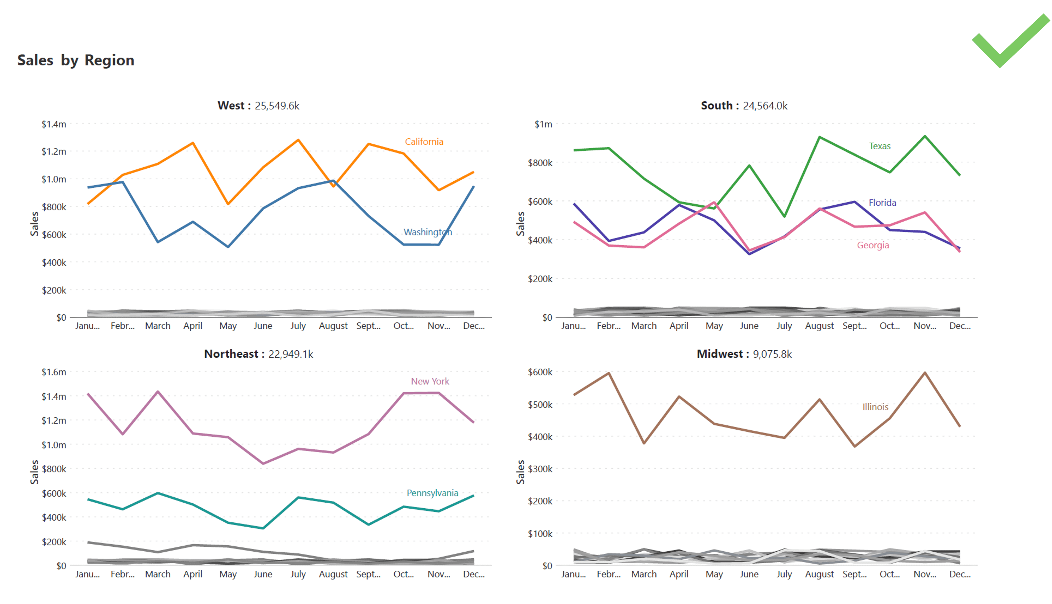
For instance, grouping sales data from multiple states into four regional charts: West, Midwest, South, and Northeast. Each chart visually represents aggregated metrics for states within that region, using color coding to highlight significant contributors. Moreover, intermediate small multiples enable direct comparisons within the same chart. This feature facilitates instant insights—for example, comparing California's sales performance against Washington's within the West region—highlighting regional strengths and areas needing improvement in a single view.
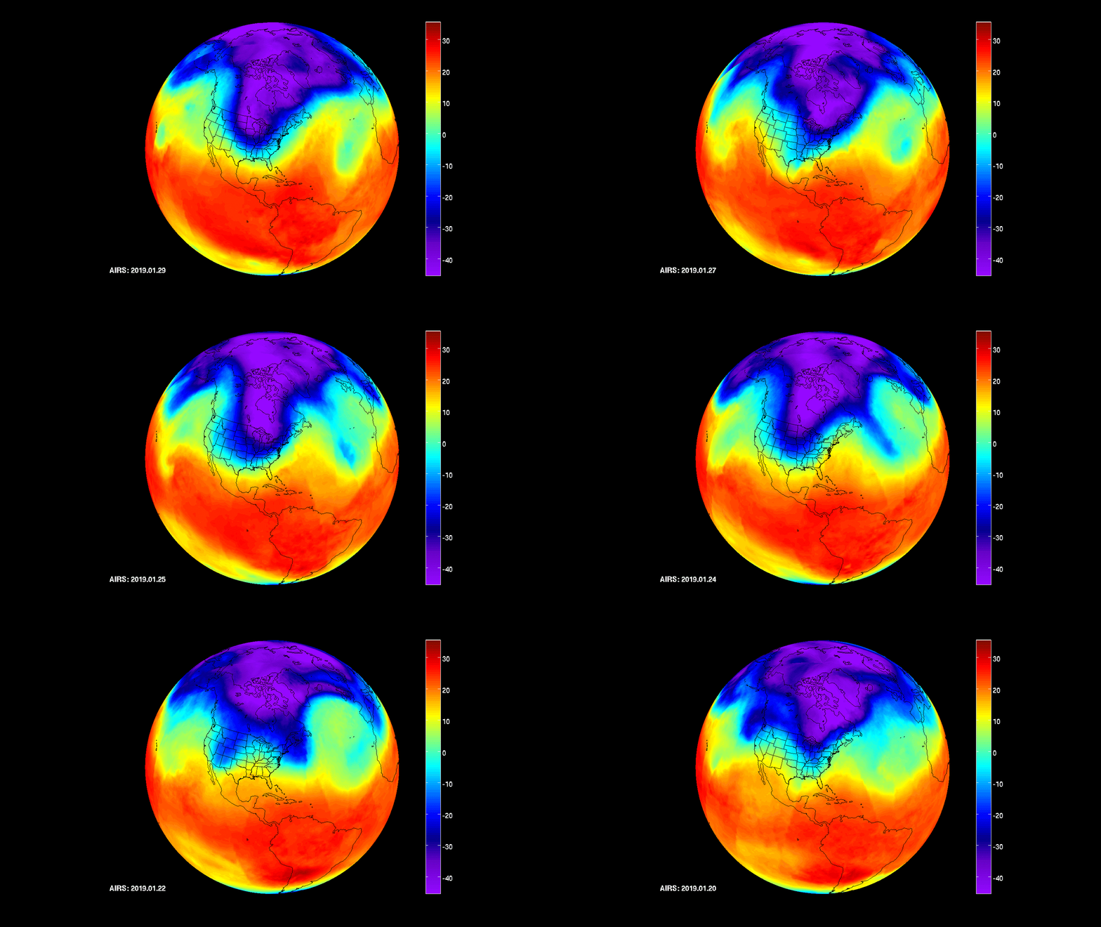
While traditional small multiples were confined to static images, modern computing introduces animated charts as a dynamic alternative. These animated visuals provide a compelling way to present data trends over time or across geographies, enhancing viewer engagement and comprehension.
For example, consider a global warming visualization that dynamically illustrates temperature changes across different regions over decades. This animated chart not only captures global trends but also allows viewers to observe temporal and spatial variations in temperature data more intuitively than static graphics.
In today's technological landscape, interactive charts offer a dynamic way to engage audiences and delve deeper into data insights.
For instance, imagine a dashboard created using Power BI where viewers can utilize slicers to filter and drill down into specific aspects of the data. This interactivity enables users to customize their viewing experience by selecting variables of interest, adjusting timeframes, or exploring different geographical regions—all within the same chart interface.
Instead of cluttering a presentation with multiple charts for each variable, tooltips offer an efficient alternative to enhance data visualization while maintaining clarity. With tooltips, viewers can explore additional variables and insights directly within a single chart interface.
For example, consider a chart comparing profit versus target across different months. By hovering over a specific data point, such as a monthly performance metric, a tooltip can dynamically display relevant information like variance and percentage variance.
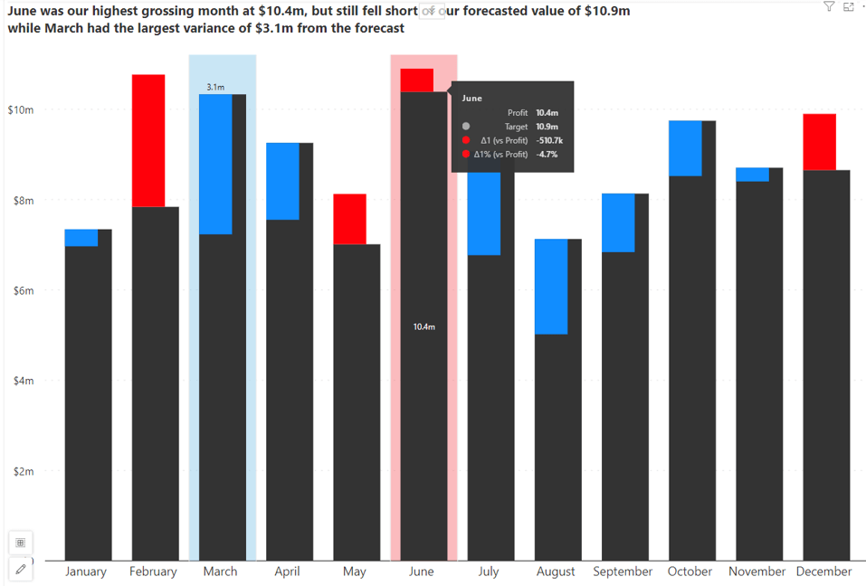
This capability allows viewers to gain deeper insights into specific data points without overwhelming them with numerous separate charts.
With Inforiver Analytics+ for Power BI, you can create impactful small multiple charts that enhance your storytelling and data visualization capabilities. The intuitive no-code user experience (UX) helps even the casual users build dashboards and storyboards in minutes with 100+ charts, cards and tables integrated in a single visual.
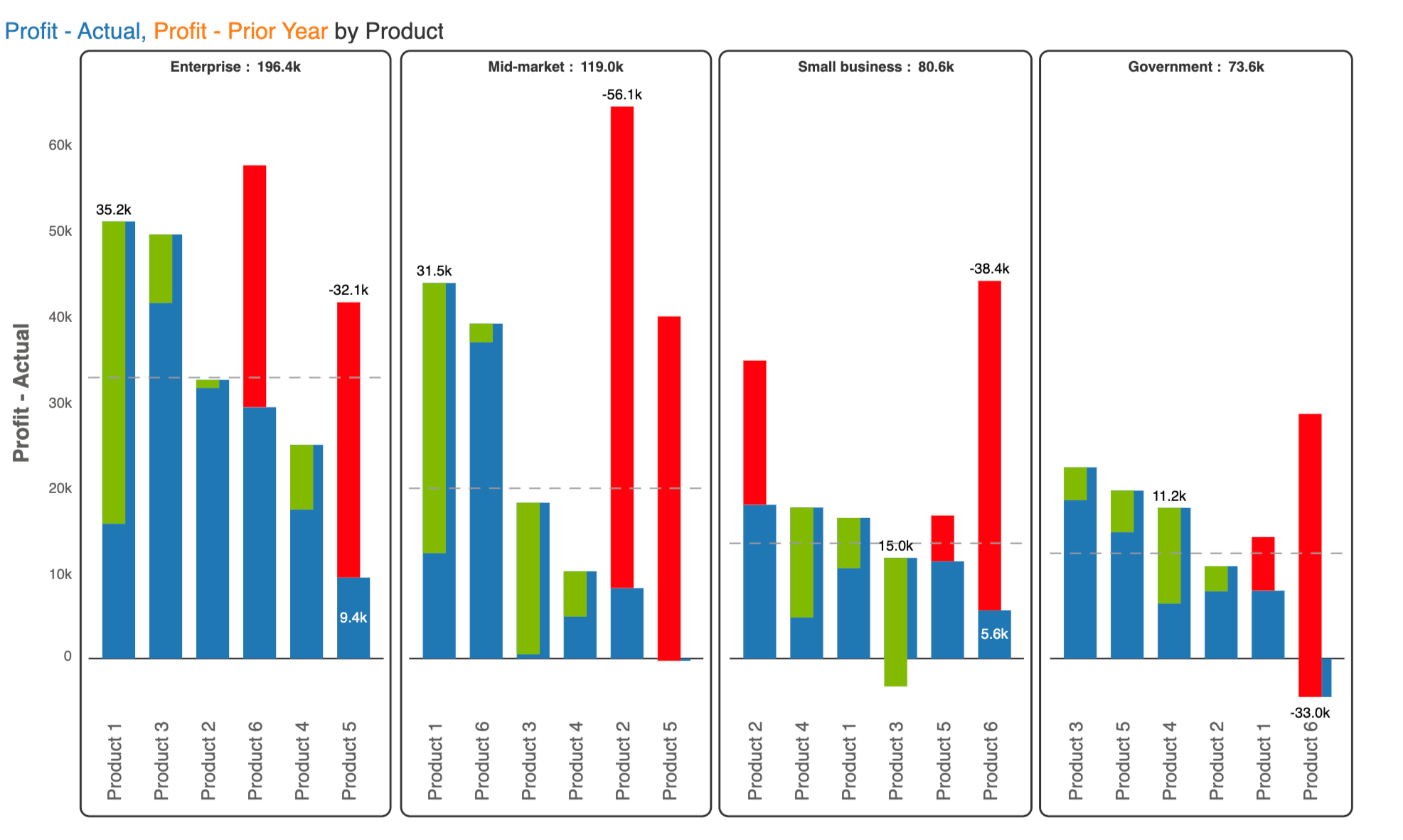
For instance, let's create single group small multiples using Inforiver Analytics+ showing profit across products and customer segments.
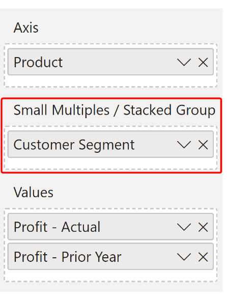
Step 1: Drag and drop "Product" under Axis, "Customer Segment" under Small Multiple/Stacked Group, and "Profit -Actuals" and "Profit- Prior Year" under Value.
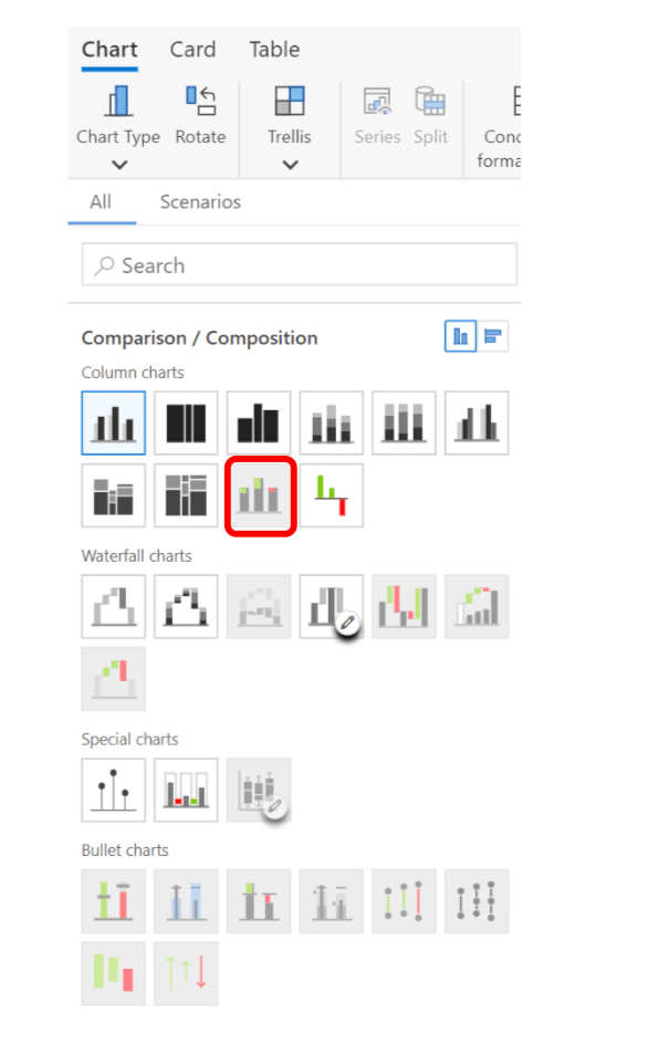
Step 2: Select the Integrated Variance Chart from the Column Charts section.
Your single group small multiples chart is ready.
Inforiver helps enterprises consolidate planning, reporting & analytics on a single platform (Power BI). The no-code, self-service award-winning platform has been recognized as the industry’s best and is adopted by many Fortune 100 firms.
Inforiver is a product of Lumel, the #1 Power BI AppSource Partner. The firm serves over 3,000 customers worldwide through its portfolio of products offered under the brands Inforiver, EDITable, ValQ, and xViz.