
Upcoming webinar on 'Inforiver Charts : The fastest way to deliver stories in Power BI', Aug 29th , Monday, 10.30 AM CST. Register Now
Upcoming webinar on 'Inforiver Charts : The fastest way to deliver stories in Power BI', Aug 29th , Monday, 10.30 AM CST. Register Now
One of the most pressing global challenges in recent decades has been tackling greenhouse gas emissions and reducing our carbon footprint. A Marginal Abatement Cost (MAC) curve, sometimes called a Marginal Cost Curve (MCC), is a graphical tool used to visualize carbon mitigation opportunities along with their abatement potential and marginal cost. These charts provide a cost versus reward view of different abatement strategies and are used to create carbon mitigation plans based on these trade-offs.
Please feel free to jump straight into the section that interests you.
Carbon abatement is defined as the reduction in the amount of carbon dioxide (CO2) emitted through the burning of fossil fuels like coal and petroleum. Fossil fuels have been the main source of energy since industrialization in the 18th century, and the resulting increase in the quantity of CO2 in the atmosphere has led to a spike in global temperatures. This has wide-reaching negative implications for economies as well as ecosystems, putting carbon abatement at the forefront of policy decisions.
Carbon abatement can be performed via a number of different strategies, and each strategy offsets emissions by a certain quantity. Switching from fossil fuels to renewable energy sources, planting trees to capture carbon, and reducing electricity consumption are all examples of carbon abatement strategies. The amount by which a strategy offsets carbon emissions is called its carbon abatement potential, usually measured in tons of CO2 emitted (t CO2e).
Marginal cost is the change in cost per unit increase in quantity. For example, a company may produce 100 units at a fixed cost of $5000 and a variable cost (say, of the materials used) of $50 per unit, which gives a total cost of $10,000. Ramping up its production from 100 units to 150 units, would mean that the total cost is $12,500 (fixed cost of $5000 + variable cost of $7500 at $50/unit).
This means that the marginal cost of increasing production from 100 to 150 units is $50 per unit (i.e., ($12,500 - $10,000)/(150-100) = $2500/50). Marginal cost is thus measured per unit.
In the case of carbon abatement, marginal abatement cost refers to the cost incurred per unit abatement in carbon. This is usually measured in dollars per ton of CO2 emitted ($/ t CO2e). Marginal cost can be positive or negative, with negative cost indicating a net economic benefit.
A Marginal Abatement Cost (MAC) Curve is a type of bar chart where each bar represents one abatement opportunity, with the height of the bar corresponding to the marginal cost of abatement, and the width of each bar scaled according to the abatement potential. This is in fact a type of Marimekko chart called a variable width bar chart.
It is important to note that abatement potential and marginal abatement cost are always measured with respect to a baseline and within a specific timeframe. The baseline from which carbon abatement potential is measured is typically the “business-as-usual” scenario – i.e., how much CO2 would be prevented from being emitted by adopting a specific abatement strategy when compared to continuing with no change made to curb emissions? This is of course measured within a given timeframe as the quantity of emissions would change over time.
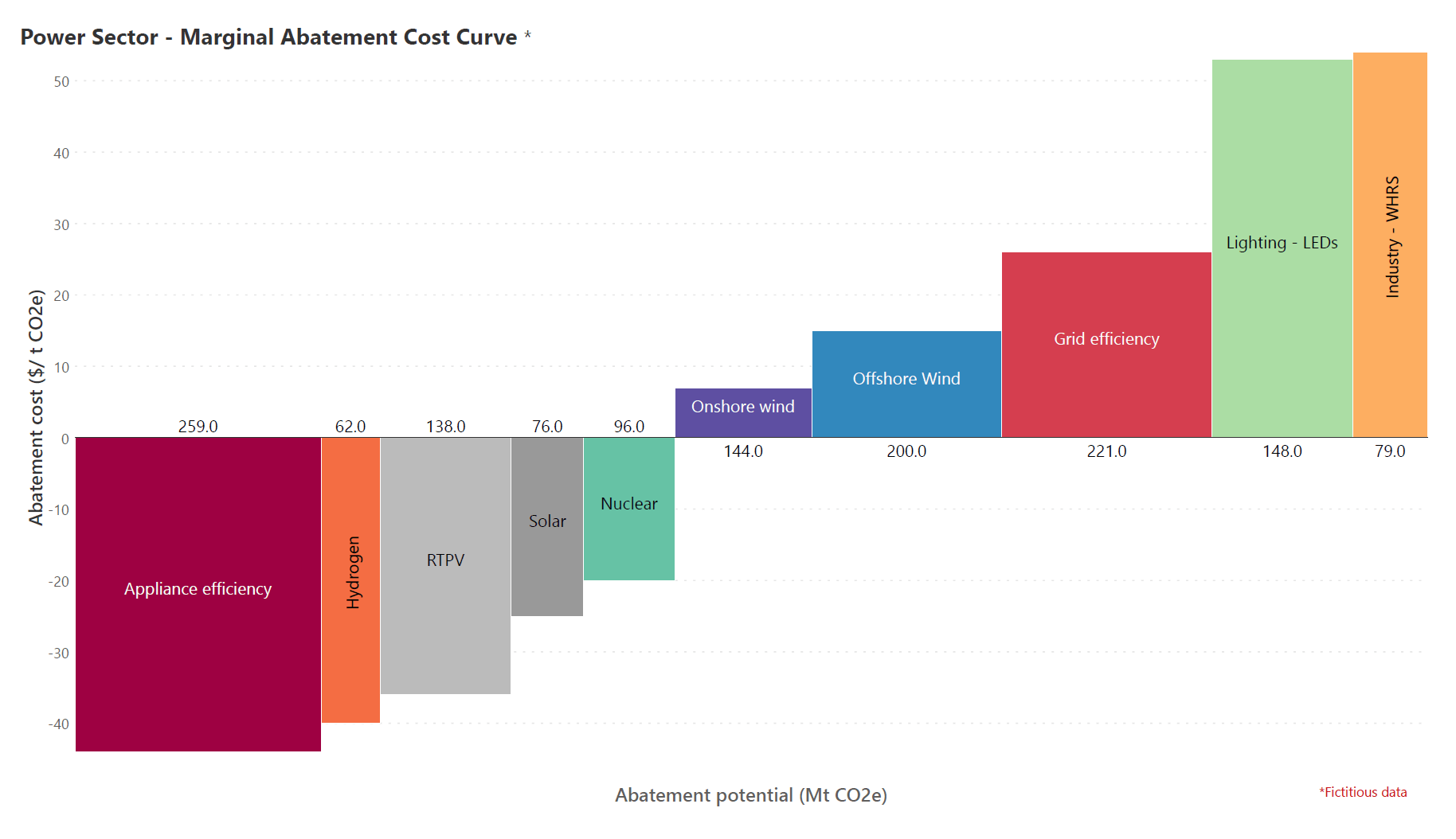
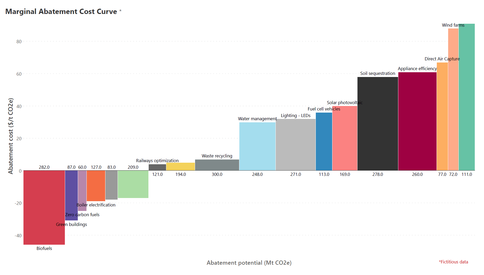
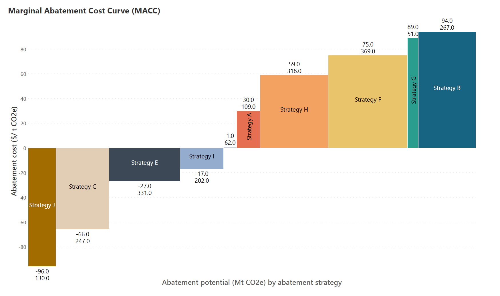
Each of the bars in a MAC curve represents one carbon abatement strategy. The height of the bar corresponds to the marginal cost of that strategy, i.e., the cost (usually in dollars or other currency) per ton of carbon dioxide not emitted, while the width of each bar is scaled by abatement potential, i.e., the amount of carbon dioxide reduced through that strategy. The area of the bar can thus be read as the total cost for that abatement strategy. By sorting the bars by marginal abatement cost, we can easily choose strategies that have the least costs with the greatest abatement benefits, i.e., the most cost-efficient options. It is to be noted that the marginal (and therefore the total) cost can be positive or negative – a negative cost (strategies towards the left side of the chart below) indicates a net economic gain, while a positive cost indicates a net economic loss.
Dating to the 1980s, MAC curves have heavily influenced climate policy decisions over the last few decades after an increase in popularity following consulting firm McKinsey’s work. They are standard tools today in assessing and creating national and international policy frameworks for carbon mitigation.
MAC curves can be used at all levels of the hierarchy – from companies seeking to fulfill their Environmental Social Governance (ESG) responsibilities to countries and international bodies making high-level policy decisions. For example, a company may use them to determine how to most efficiently utilize its ESG budget to produce the largest reductions in emissions possible. The chart below shows the interventions that a fictional company is considering based on its total budget of $ 80,000.
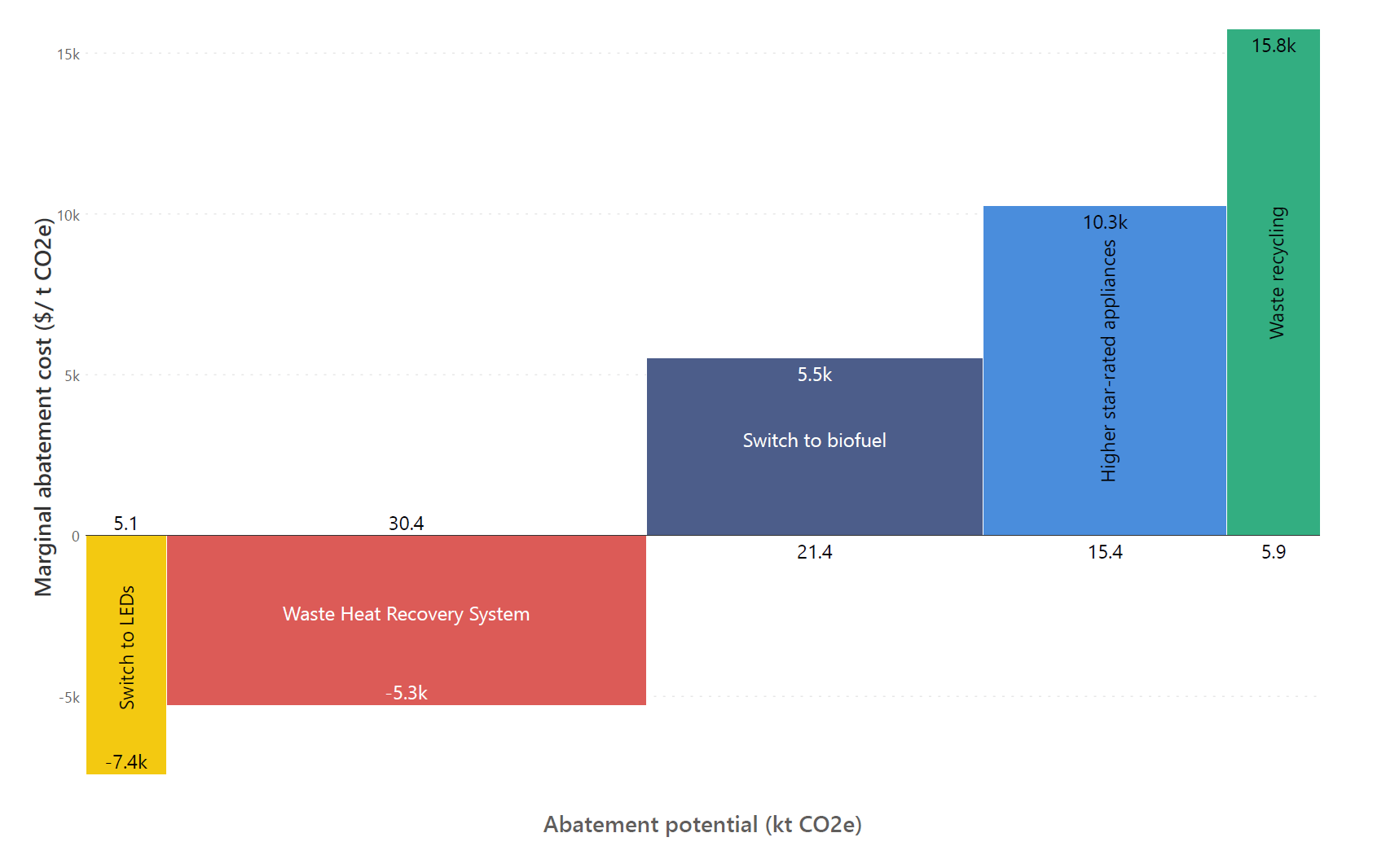
Assessing the marginal cost for each measure helps the company choose the most cost-efficient abatement strategy, while assessing the total cost helps the organization stay within its budget.
Given the chart above, the company may adopt the following strategy:
Similarly, countries often use MAC curves in determining their carbon mitigation policies, with consideration given both to the available funds as well as pledges or commitments to reduce carbon footprint by a certain quantity within a specific timeframe. These pledges have been made by governments around the world at the United Nations COP summits.
MAC curves also pose several limitations that need to be kept in mind while creating carbon mitigation plans.
First, it is important to remember that our mitigation measures may have interdependencies with each other, which means that they cannot be considered as independent strategies. For example, making the switch to Electric Vehicles (EVs) from petrol or diesel cuts down on direct emissions from burning fuel. However, the electricity used to power the vehicle is still produced in a thermal power plant, which makes decarbonizing the transport sector dependent on decarbonizing power generation. However, this in turn depends on electricity demand, which depends once again on the number of EVs. A MAC curve instead treats these measures as independent while displaying marginal costs and abatement potentials.
Using a MAC curve to choose mitigation strategies can sometimes lead to a very inefficient approach. This is because a MAC curve does not consider the speed at which changes are made. We usually choose to implement the most cost-effective measures first before moving to more expensive measures based on our MAC curve. However, more expensive measures may require a longer implementation time frame to keep them cost effective and logistically feasible, which means that it makes economic sense to begin with the most difficult sectors.
For example, making the switch from gas to induction stoves in a very short timeframe would cause demand for induction stoves to skyrocket, which in turn would cause problems in the supply chain and drive the cost of transition up. However, making the change gradually would be a better long-term choice even if this mitigation strategy is more expensive in terms of total cost. In this context, we must also take into account that carbon costs only increase over time. Postponing hard to abate sectors only increases the total cost of our abatement plan.
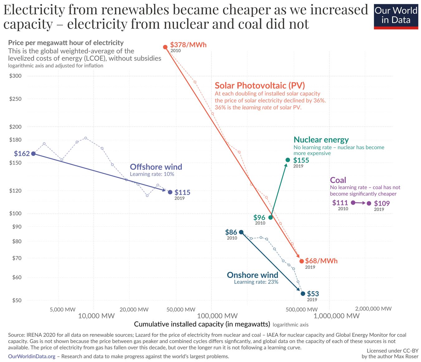
It is also important to remember that the scope and efficiency of technologies evolve over time, which is not visible from our MAC curve. For example, solar photovoltaics and wind energy were considered very expensive at their advent. However, with increase in capacity because of investment in these sectors, the price of electricity from these renewables dropped, as seen in the chart below.
Finally, it is important to note that MAC curves were designed for marginal improvements to the carbon footprint. However, we have now reached a stage where we aim for net zero carbon emissions. This means that instead of aiming for, say, a 10% decrease in emissions, we aim for a 100% reduction. This puts the focus on minimizing the total cost rather than just the marginal cost, which necessitates different strategies that make radical changes to our production and consumption patterns. The building sector illustrates this conundrum. The chemical process of manufacturing cement produces CO2. Our current strategy for tackling these emissions is by Carbon Capture Uptake and Storage (CCUS), for example by planting trees that capture the CO2 emitted. However, this is a marginal approach. A 100% abatement in the building sector would require using alternatives to cement – an approach that is not currently feasible due to the dearth of alternatives.
MAC curves were conceived in the 1980s as cost curves to reduce electricity consumption after the oil price crash of the 1970s. At this time, they were called saving curves or conservation supply curves, rather than MAC curves. They have since been used to visualize the costs and potential benefits of waste reduction, water availability, energy savings and air pollutant abatement.
More generally, MAC-like curves can be used to visualize the marginal cost and supply potential of economic goods, or alternately, the marginal cost and reduction potential of an economic bad.
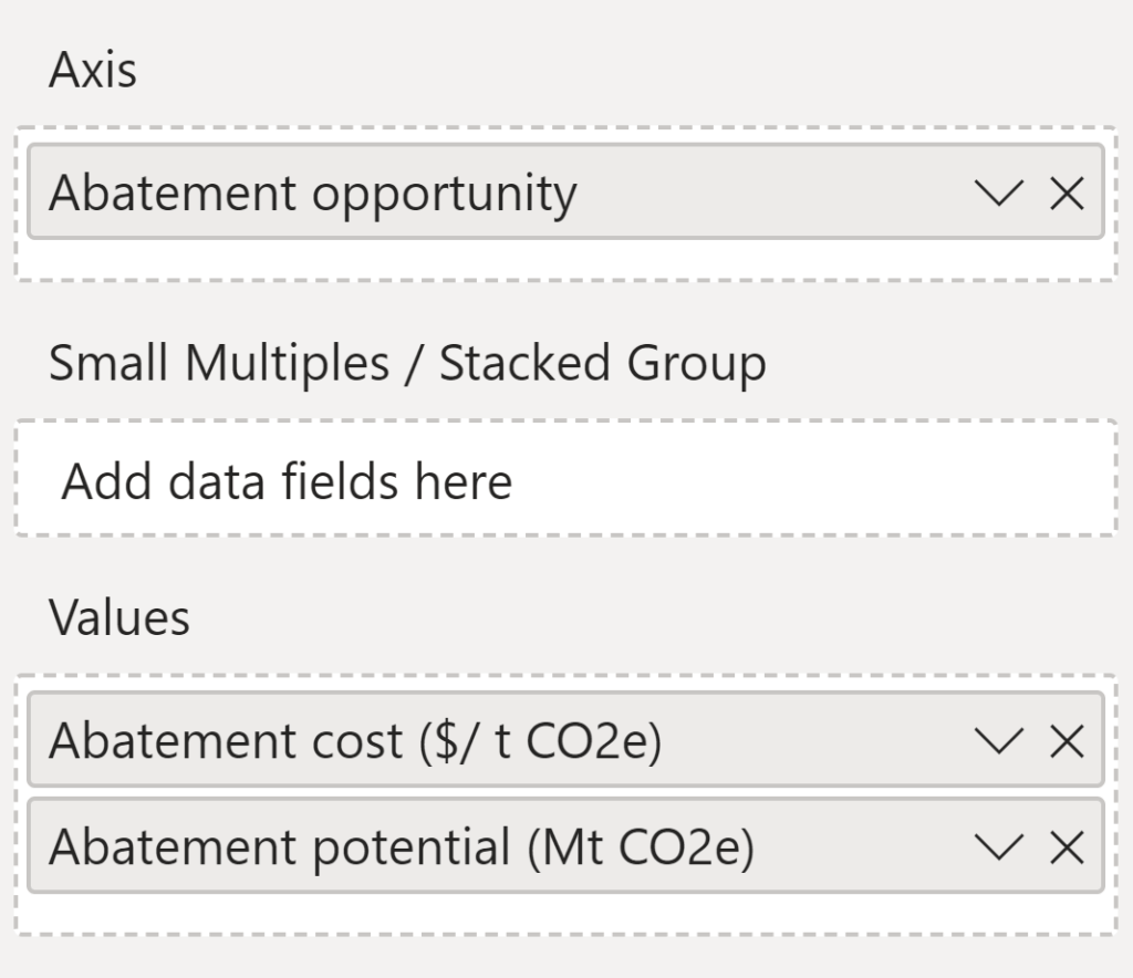
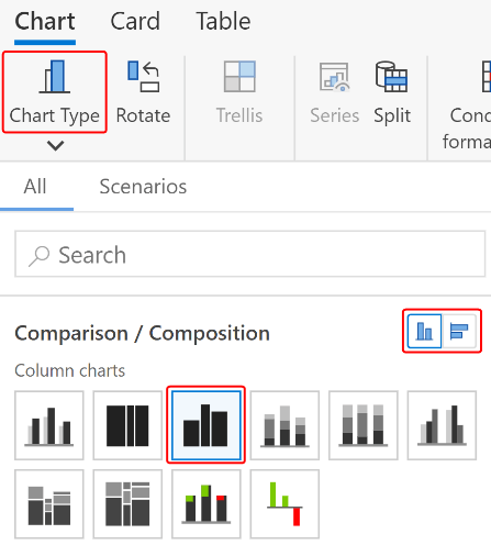
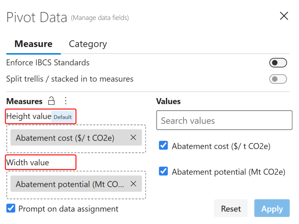
Inforiver Analytics+ offers 50+ chart types in Power BI, including the variable width Marimekko chart used for MAC curves. In fact, you can create a MAC curve in Analytics+ in just 3 easy steps:
2. Choose the Vertical Marimekko chart under the Chart Type menu:
3. Use Pivot Data to configure your height and width values:
Your MAC curve is ready!
Get your free copy of Inforiver Analytics+ here to try out MAC curves for yourself with advanced customization options!


About Inforiver!
Inforiver is the fastest way to do everything in Power BI. It enables citizen developer productivity and unleashes true self-service with our intuitive and interactive no-code data app suite for Microsoft Power BI. The product is developed by Lumel Technologies Inc, who are #1 Power BI Visuals AppSource Partner serving over 3,000+ customers worldwide with their xViz, Inforiver, and ValQ offerings.


 Join this webinar for a wide-ranging exploration of different chart types and their uses, their role in effective data stories and a LIVE DEMO in Power BI on creating 50+ chart types with in-built storytelling customizations.