
Upcoming webinar on 'Inforiver Charts : The fastest way to deliver stories in Power BI', Aug 29th , Monday, 10.30 AM CST. Register Now
Upcoming webinar on 'Inforiver Charts : The fastest way to deliver stories in Power BI', Aug 29th , Monday, 10.30 AM CST. Register Now
Data Writeback from Power BI to Fabric Onelake / Data Warehouse Book a demo!

Migrate from Tableau /Spotfire / Qlik / Think-cell
Storyboards & dashboards
60+ Charts | Cards |Tables
Layout Builder
Migrate from Cognos, SAP WEBI/Crystal, WebFOCUS
Paginated reports
Financial statements
IBCS Variance reports
Date & time: May 02, 2024, 10 AM CST I Speaker: Gopal Krishnamurthy, Founder/CEO
Date & time: Dec 20, 2023, 8 AM CST | Speaker: Gopal Krishnamurthy, Founder/CEO | Host: Artur König


A no-code, IT-independent solution with full end-to-end audit capability


Khaled Chowdhury
Former Global Director – Data & Analytics, CMC Materials

Michael Winslett
Senior Manager , AMD

I don’t think of Inforiver as just a custom visual. I think of it as the best in class solution to a wide range of problems that traditionally we were only able to solve with Excel. I can’t think of a better way to lift and shift your traditional Excel-marts into a modern Power BI platform.

Andre Fomin
Managing Director, obviEnce

Rajan Zejnuni
Manager Business Process & Data Intelligence, Adapa
Khaled Chowdhury
Global Director – Data & Analytics, CMC Materials
Michael Winslett
Senior Manager , AMD
I don’t think of Inforiver as just a custom visual. I think of it as the best in class solution to a wide range of problems that traditionally we were only able to solve with Excel. I can’t think of a better way to lift and shift your traditional Excel-marts into a modern Power BI platform.
Andre Fomin
Managing Director, obviEnce
Rajan Zejnuni
Manager Business Process & Data Intelligence, Adapa
Explore what Inforiver can do for you
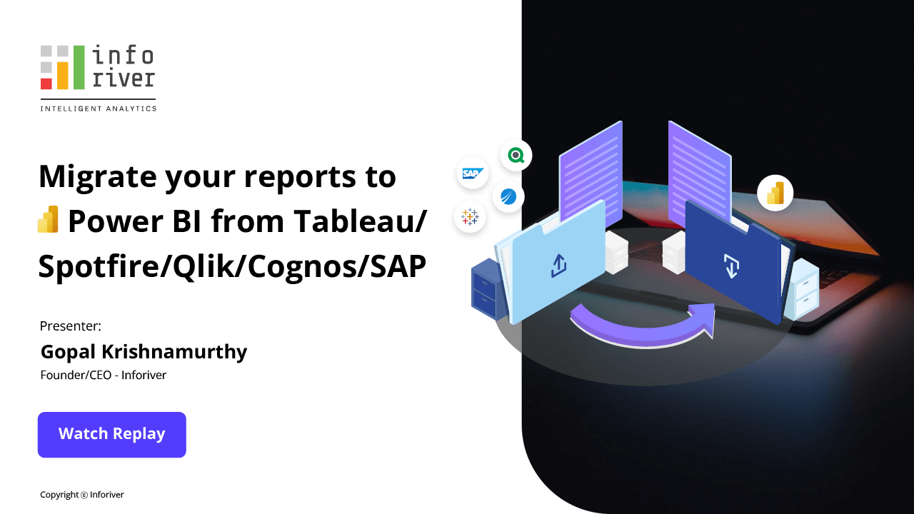
Migrate your reports from Tableau, Spotfire, Qlik, Cognos and SAP to Power BI seamlessly.

In this webinar, experience a LIVE DEMO of how Analytics+ delivers advanced features in Power BI

In this webinar, we will dive deep into Inforiver’ s no-code write-back solution architecture and compare it with other options such as Power Apps, Power on.


Get your questions answered, respond to other user queries, submit feature requests, catch up on recent product updates and more.


About Inforiver!
Inforiver is the fastest way to do everything in Power BI. It enables citizen developer productivity and unleashes true self-service with our intuitive and interactive no-code data app suite for Microsoft Power BI. The product is developed by Lumel Technologies Inc, who are #1 Power BI Visuals AppSource Partner serving over 3,000+ customers worldwide with their xViz, Inforiver, and ValQ offerings.


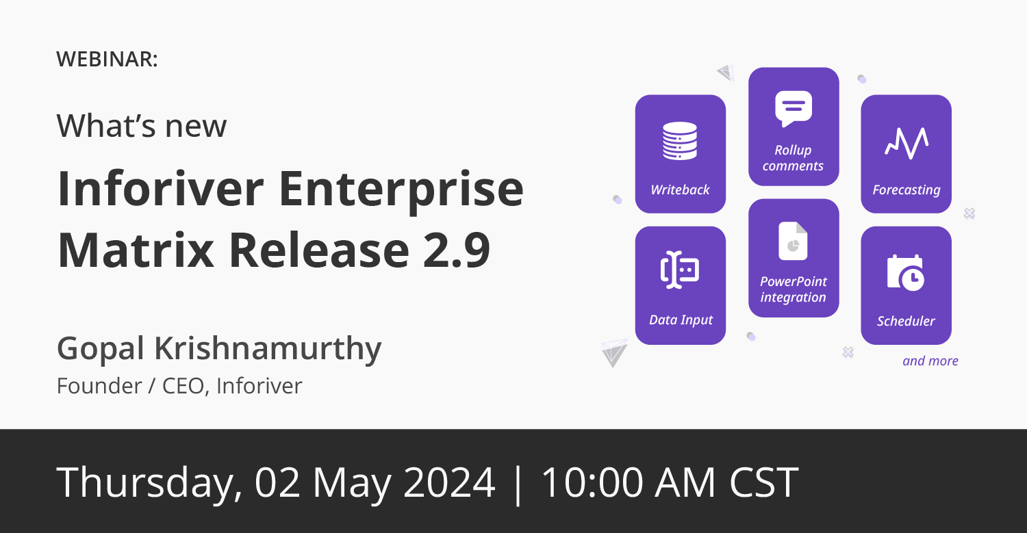 Join this webinar to explore the significant upgrades in Inforiver Enterprise 2.9, highlighting new capabilities such as enhanced writeback options, dynamic data inputs, and advanced forecasting controls.